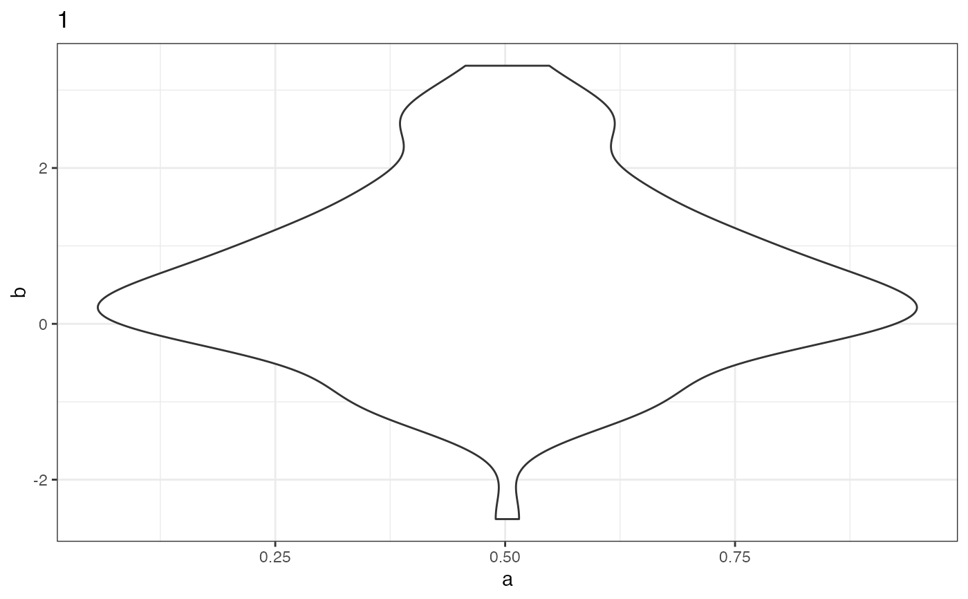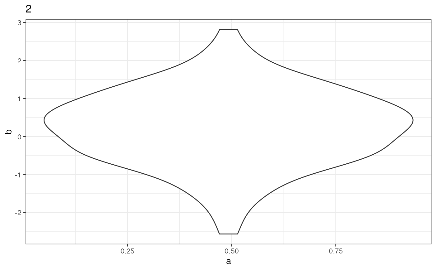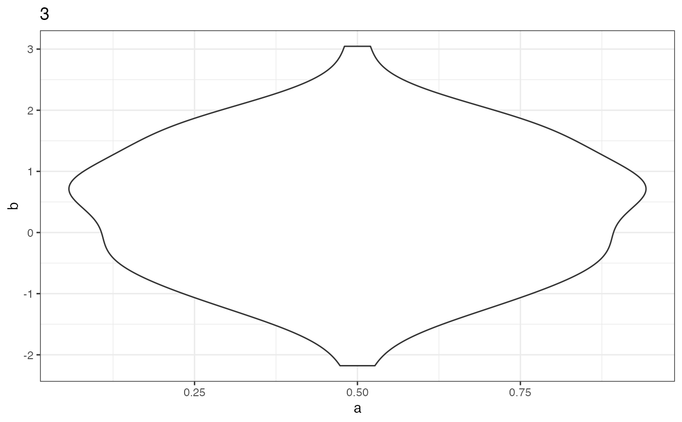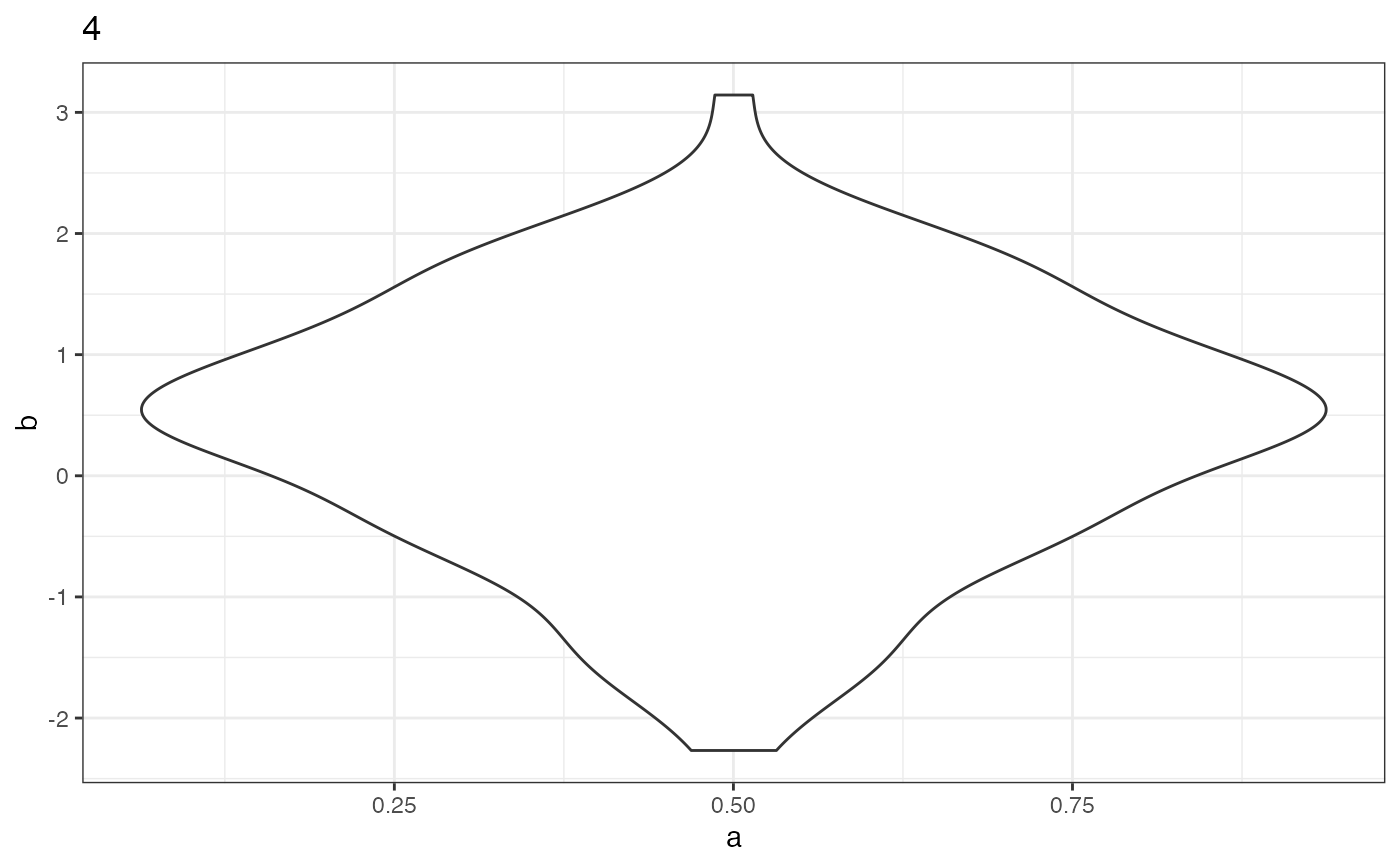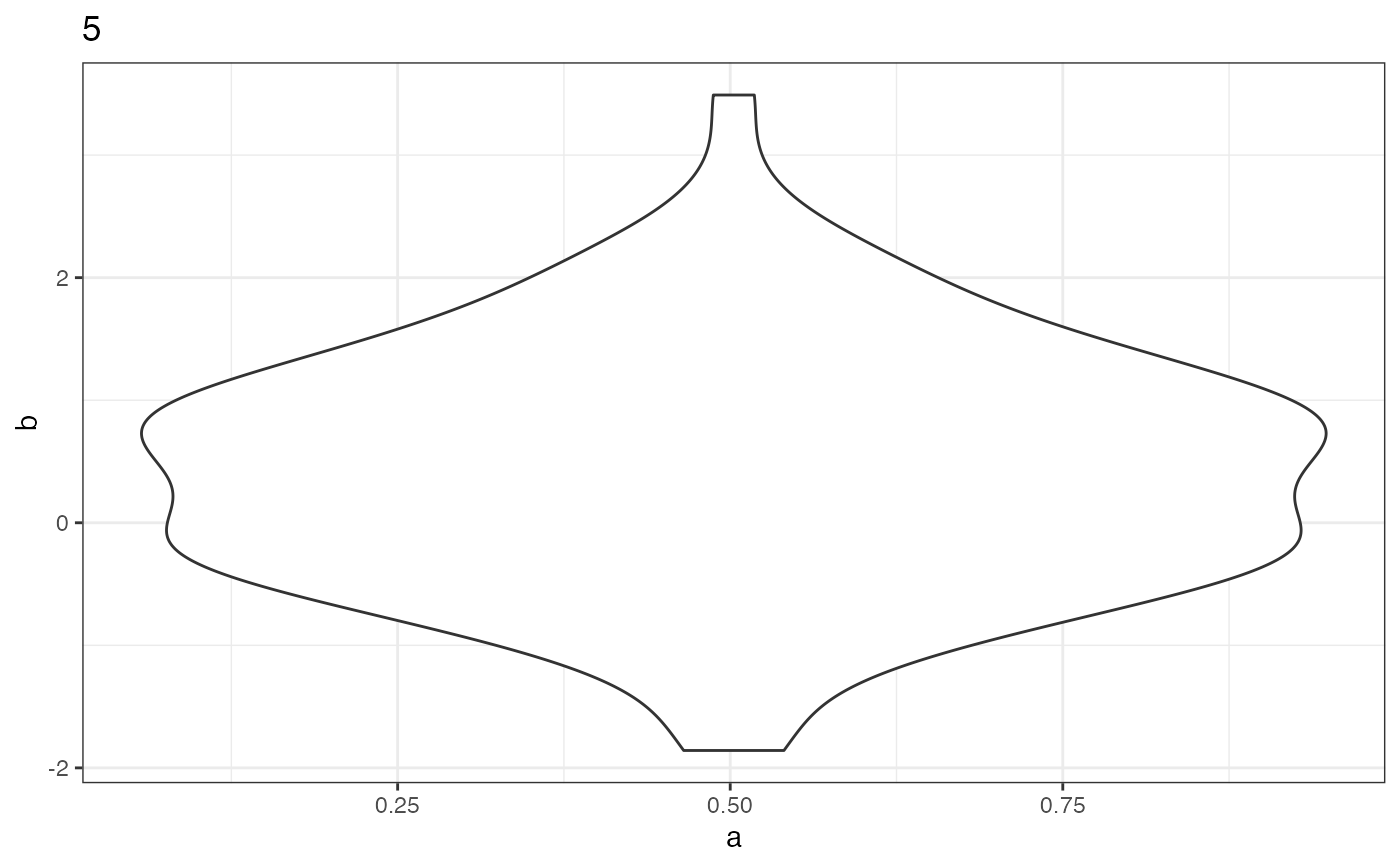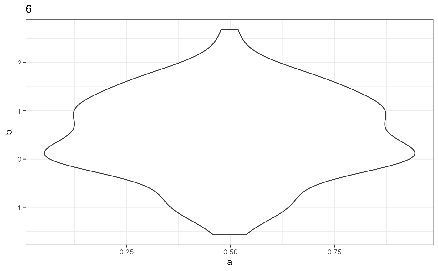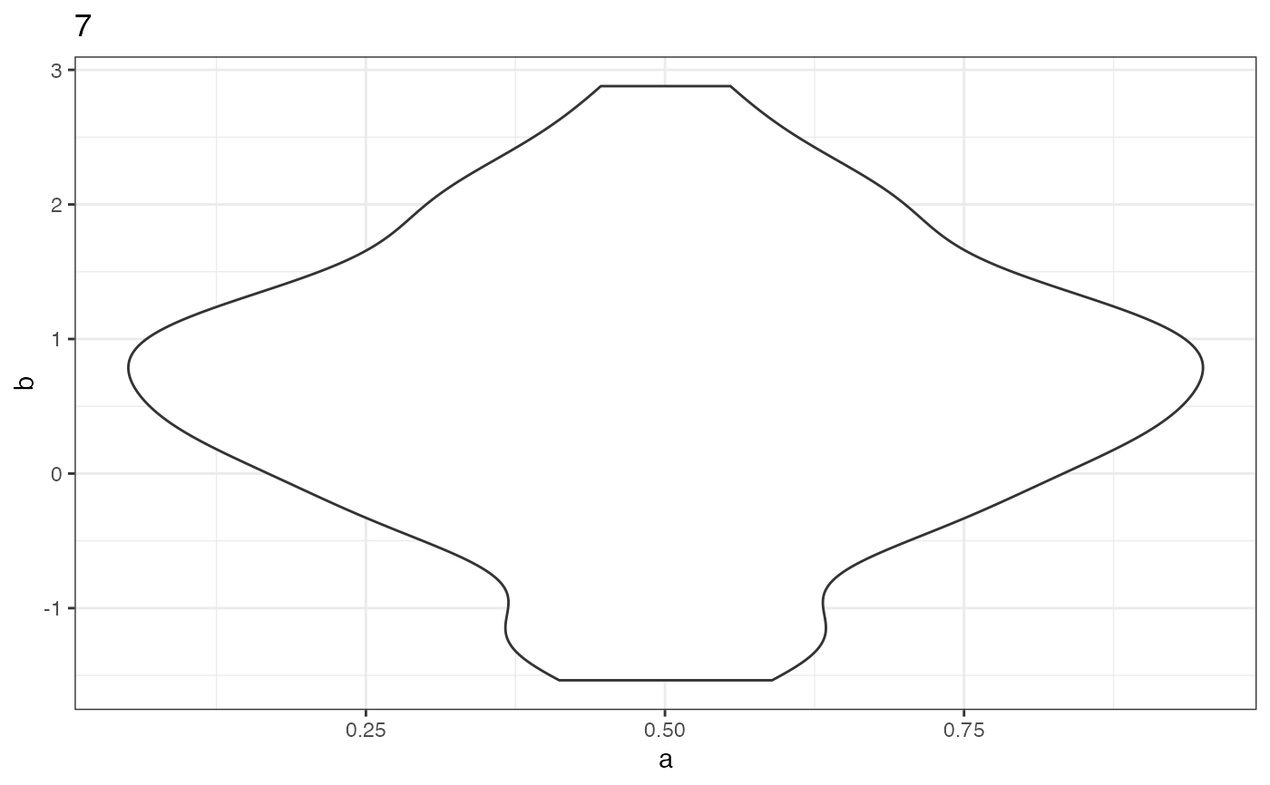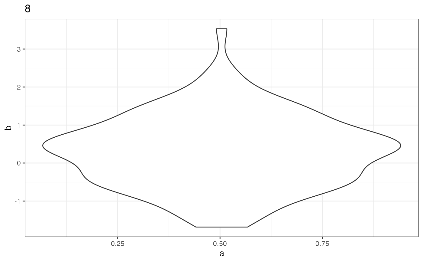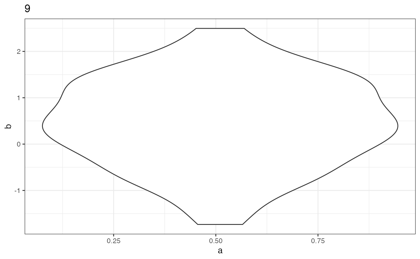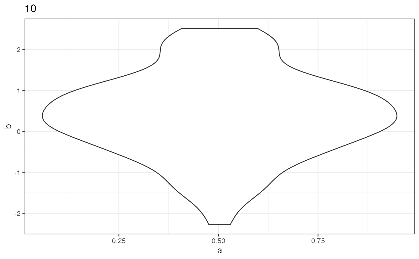
Draws the distribution of y across values of x, separately for each group.
Author
Charles Crabtree charles.crabtree@monash.edu
Examples
a <- runif(1000, min = 0, max = 1)
b <- a + rnorm(1000, mean = 0, sd = 1)
c <- rep(c(1:10), times = 100)
data <- data.frame(a, b, c)
violinplots("a", "b", "c", data)