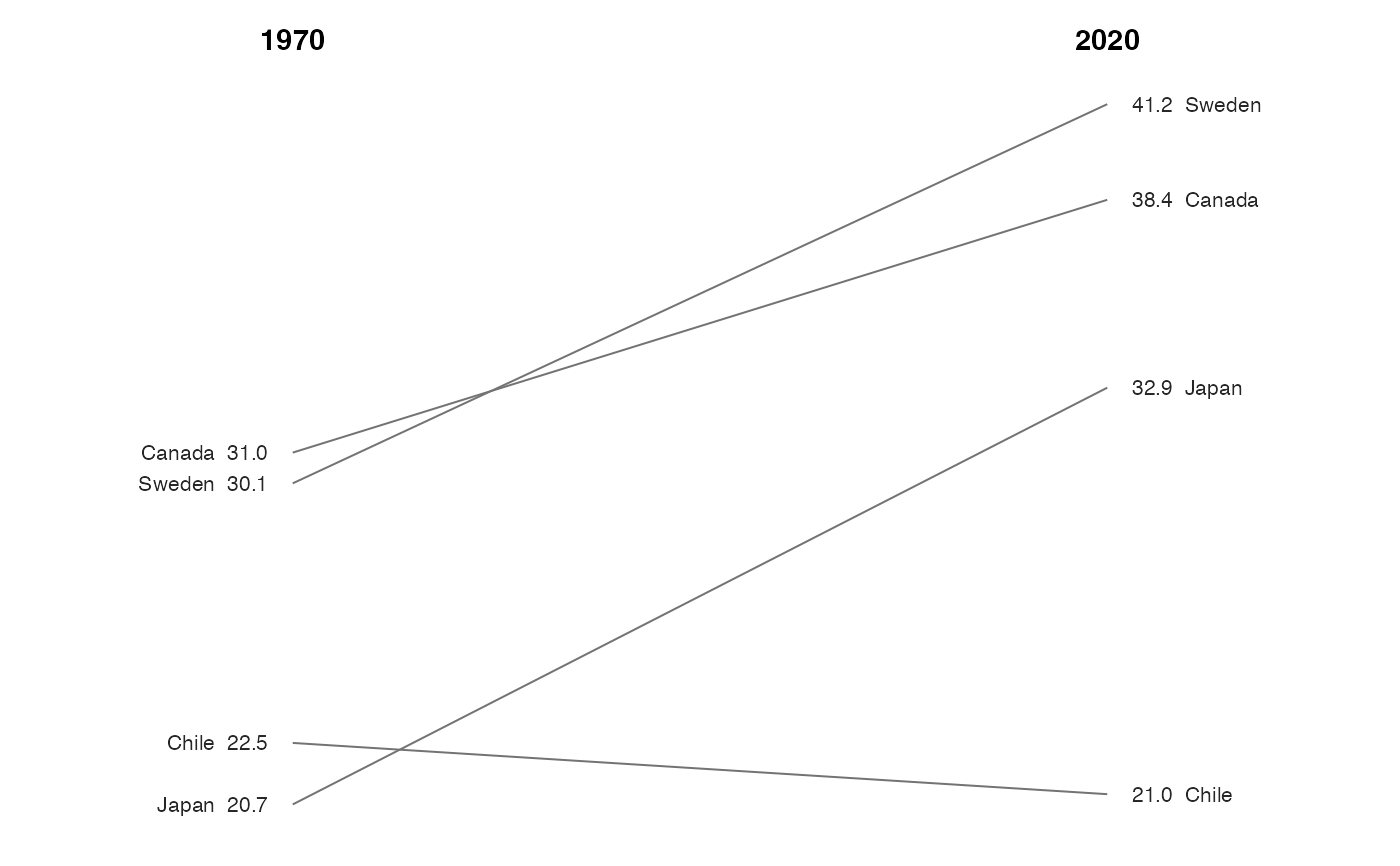
Compare values across two periods, with a line for each unit and a label at each end. Line crossings show changes in rank. Tufte's version prints the values directly, so the y axis is removed.
Usage
slopegraph(
  data,
  x,
  y,
  group,
  label_size = 2.8,
  line_colour = "grey45",
  linewidth = 0.35,
  point_size = 0,
  accuracy = 0.1,
  direction_colour = FALSE,
  min_gap = 0.03
)
Arguments
- data
A data frame in long form: one row per unit per period.
- x
Bare column name for the period. Coerced to a factor; its levels set the left-to-right order.
- y
Bare column name for the value.
- group
Bare column name identifying the unit.
- label_size
Size of the printed labels. Defaults to
2.8.- line_colour
Colour of the connecting lines. Defaults to
"grey45".- linewidth
Width of the connecting lines. Defaults to
0.35.- point_size
Size of the dots at each period. Set to
0to omit them, as Tufte usually does.- accuracy
Rounding for the printed values, passed to
label_number().- direction_colour
Logical. Colour lines by whether the unit rose or fell between the first and last period? Defaults to
FALSE.- min_gap
Minimum vertical separation between labels, as a fraction of the y range. Labels closer than this are nudged apart. Set to
0to disable. Adjust this for the font size and spacing in your figure.