Here I use a saved snapshot from four public APIs. The simulated examples are useful for controlled comparisons; these data show how the tools handle less tidy distributions.
| Source | What it gives | Endpoint |
|---|---|---|
| CRAN download logs | daily downloads per package | cranlogs.r-pkg.org |
| USGS FDSN event service | every earthquake above a magnitude | earthquake.usgs.gov |
| Open-Meteo ERA5 archive | daily temperature anywhere, back to 1940 | archive-api.open-meteo.com |
| Wikimedia REST API | daily pageviews per article | wikimedia.org |
How the fetching works
The page reads the saved snapshot, so a documentation build doesn’t
depend on the APIs being available. To refresh it, run data-raw/fetch_live_examples.R.
The APIs used here don’t require authentication.
Here’s an example of the requests.
library(jsonlite)

# Daily downloads for one package, last 180 days.
fromJSON(sprintf(
  "https://cranlogs.r-pkg.org/downloads/daily/%s:%s/ggplot2",
  Sys.Date() - 182, Sys.Date() - 2
))$downloads[[1]]

# Every earthquake at magnitude 4.5 or above in the last year.
fromJSON(paste0(
  "https://earthquake.usgs.gov/fdsnws/event/1/query?format=geojson",
  "&starttime=", Sys.Date() - 365, "&endtime=", Sys.Date(),
  "&minmagnitude=4.5&orderby=time"
))

# Daily mean temperature at a point, for a decade.
fromJSON(paste0(
  "https://archive-api.open-meteo.com/v1/archive?latitude=35.68&longitude=139.69",
  "&start_date=2015-01-01&end_date=2024-12-31",
  "&daily=temperature_2m_mean&timezone=UTC"
))$daily

# Daily pageviews for one Wikipedia article.
fromJSON(paste0(
  "https://wikimedia.org/api/rest_v1/metrics/pageviews/per-article",
  "/en.wikipedia/all-access/all-agents/Edward_Tufte/daily/20260401/20260731"
))$items
The cached snapshot is included in the repository, so these examples can be built offline once the required packages are installed.
Sparklines: CRAN downloads
These are six months of daily downloads for five packages. I’ve given each series its own scale so its pattern is visible. That means heights can’t be compared across rows.
The grey band marks the interquartile range. Dots identify the
extremes and the label gives the final value. accuracy = 1
rounds downloads to whole numbers.
sparklines(live$cran, day, downloads, package, accuracy = 1)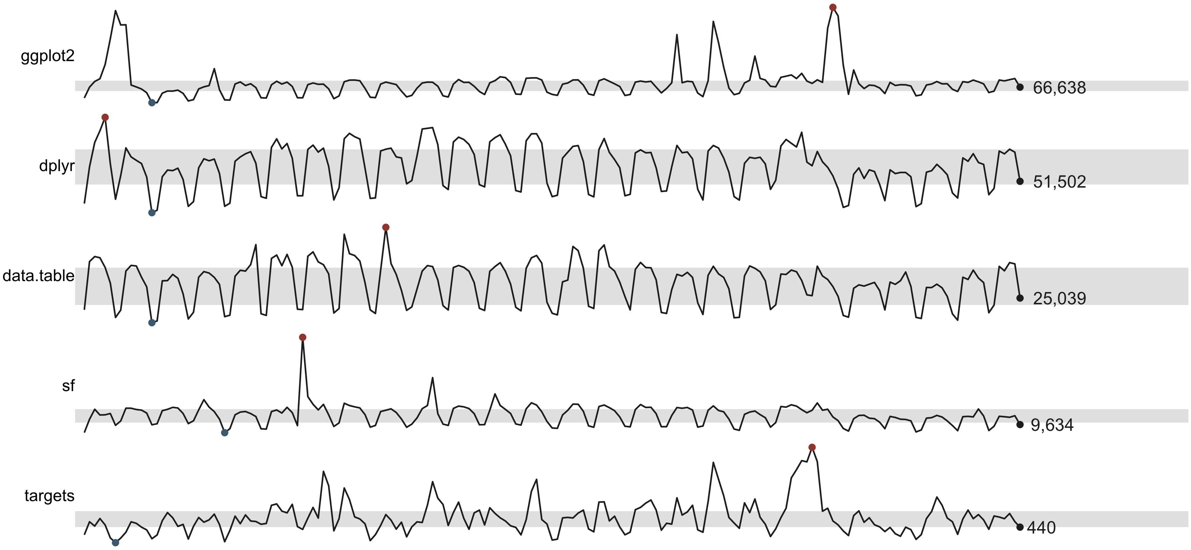
The largest ggplot2 spike reaches 264,504 downloads in a
day, compared with a median of 74,340. I don’t know what caused it.
These counts alone can’t distinguish a change in demand from automated
downloading.
Banking: how tall should that panel be?
For a single series, bank_to_45() suggests a panel
height using Cleveland’s approach to bringing the median absolute slope
near 45 degrees.
gg <- subset(live$cran, package == "ggplot2")

series <- ggplot(gg, aes(day, downloads)) +
  geom_line(linewidth = 0.3) +
  geom_rangeframe(sides = "l") +
  labs(x = NULL, y = "Daily downloads") +
  theme_tufte()

bank_to_45(series, width = 6.5)
#>
#> ── Banking to 45 degrees
#> Aspect ratio 0.148 (height / width), from 180 segments by "median_slope".
#> At 6.5in wide, that's a panel 0.96in tall. Allow more for axis labels and
#> titles.
The suggested height is for the panel. Titles and axis labels need extra space, which the following label check helps estimate.
check_labels_fit(series, width = 6.5, height = 1.3)
#> Warning in check_labels_fit(series, width = 6.5, height = 1.3): 1 element will be clipped at 6.5in x 1.3in.
#> ✖ y axis title needs 1.26in but has 0.92in.
#> ℹ Hard-wrap the text, widen the canvas, or reduce the font size.
#> # A tibble: 5 × 4
#>   element                      required_in available_in fits
#>   <chr>                              <dbl>        <dbl> <lgl>
#> 1 layout (non-panel width)           0.864         6.5  TRUE
#> 2 layout (non-panel height)          0.38          1.3  TRUE
#> 3 y axis title                       1.26          0.92 FALSE
#> 4 x axis labels (side by side)       0.417         5.64 TRUE
#> 5 y axis labels (stacked)            0.222         0.92 TRUE
I’ll add some height to give the labels room, then inspect the figure.
series
The shorter panel makes the recurring variation easy to see while keeping the large spikes visible. I’d compare this with a taller version if the individual daily changes were the focus.
Slopegraphs: two decades of temperature
This compares mean daily temperature in six Pacific-region cities for 1975 to 1984 and 2015 to 2024. Each endpoint is a ten-year average.
slopegraph(live$climate, period, mean_temp, city, accuracy = 0.1) +
  labs(
    title = "Mean daily temperature, two ten-year windows",
    subtitle = "Degrees Celsius, ERA5 reanalysis at a single grid point per city"
  ) +
  label_source("Open-Meteo ERA5 archive", note = "Fetched 2 August 2026.")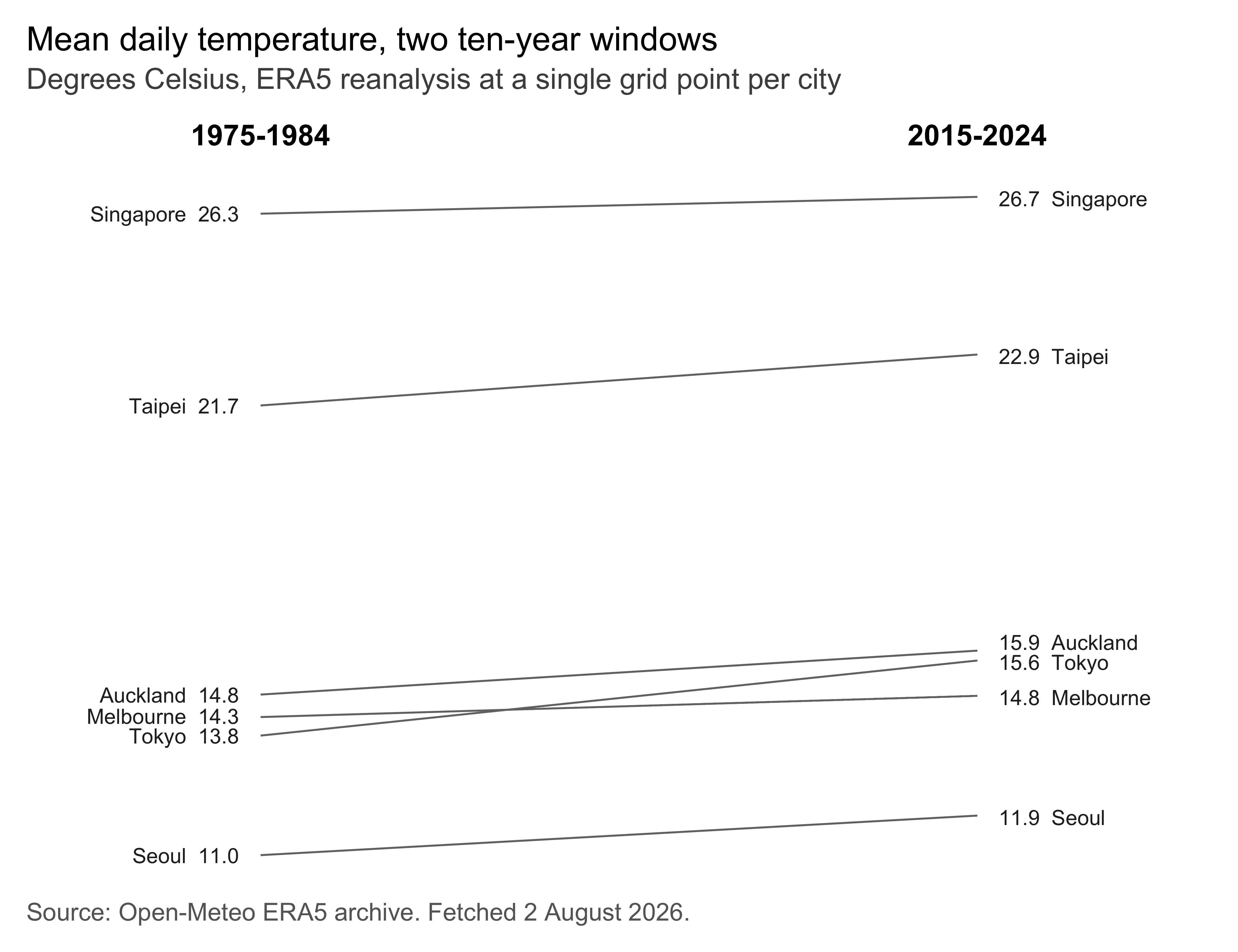
All six averages increase, by between 0.4 and 1.8 degrees. These are selected grid points from a reanalysis product. The comparison doesn’t identify the causes of the changes.
The crossing between Tokyo and Melbourne is easy to see: Tokyo starts below Melbourne and ends above it. Singapore has the highest average in both periods.
Distributions: earthquakes
The snapshot contains 7,909 earthquakes at magnitude 4.5 or above during its one-year collection window. Here’s magnitude against depth, with a quartile frame on magnitude.
q <- live$quakesI’ve used a plain range frame on depth because the distribution is strongly skewed. The median is 18 km and the maximum is 676 km. Several quartile labels would crowd together. The points still show the concentration of shallow events.
ggplot(q, aes(depth_km, magnitude)) +
  geom_point(alpha = 0.15, size = 0.7) +
  geom_quartileframe(sides = "l") +
  geom_rangeframe(sides = "b") +
  scale_y_continuous(breaks = quartile_breaks(q$magnitude)) +
  labs(x = "Depth (km)", y = "Magnitude") +
  theme_tufte() +
  label_source("USGS FDSN event service", note = "Magnitude 4.5 and above.")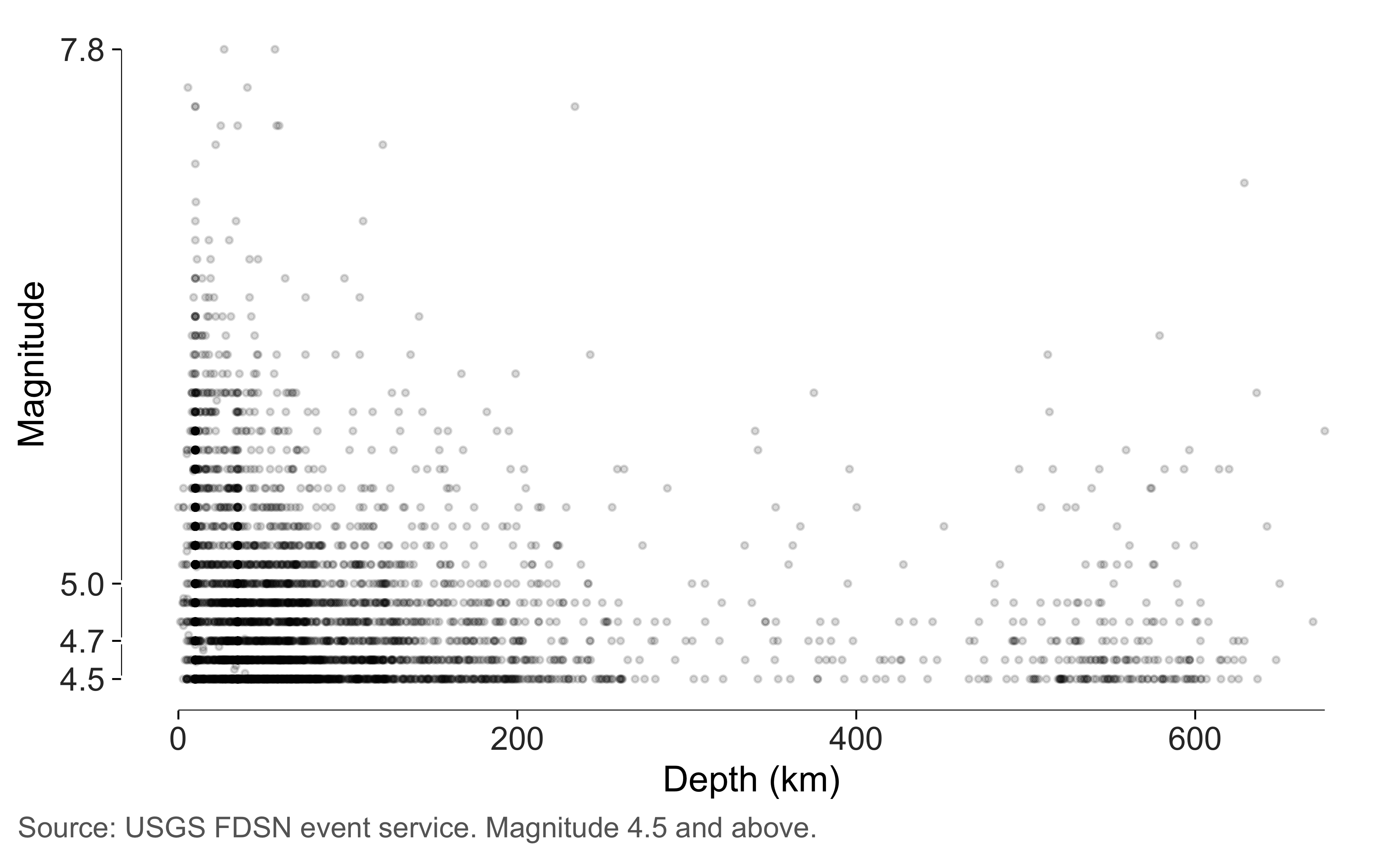
The magnitude breaks are 4.5, 4.7, 5, 7.8. Here the labels have enough room. Most events are near the lower end of the recorded range.
Next I’ll compare magnitude across depth classes using minimal box plots.
q$zone <- cut(
  q$depth_km, c(-Inf, 70, 300, Inf),
  labels = c("Shallow\n(<70 km)", "Intermediate\n(70-300 km)", "Deep\n(>300 km)")
)

ggplot(q, aes(zone, magnitude)) +
  geom_tufteboxplot(outliers = FALSE) +
  geom_rangeframe(sides = "l") +
  labs(x = NULL, y = "Magnitude") +
  theme_tufte() +
  label_source("USGS FDSN event service", note = "Magnitude 4.5 and above.")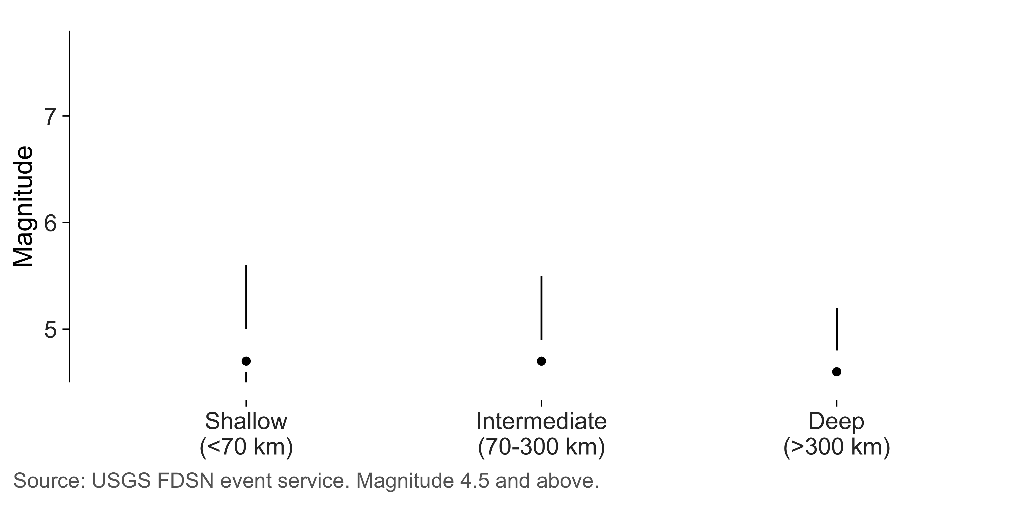
There are 289 deep events and 6,272 shallow events. Their median magnitudes are 4.6 and 4.7, respectively. Those differences should be read in the context of the catalogue’s 4.5-magnitude cutoff.
I’ve hidden the outlying points in this summary because the scatterplot above already shows them. The lower whiskers stop at the query cutoff; that limit is stated in the figure’s source note.
Dot plots: Wikipedia pageviews
These are total views of five articles over the snapshot’s four-month window. A dot plot lets us compare their positions without using bars that start far below the smallest value.
totals <- aggregate(views ~ article, live$pageviews, sum)

ggplot(totals, aes(views, stats::reorder(article, views))) +
  geom_cleveland_dot() +
  scale_x_continuous(labels = scales::label_comma()) +
  labs(x = "Total pageviews", y = NULL) +
  theme_tufte() +
  label_source("Wikimedia REST API", note = "English Wikipedia, all agents.")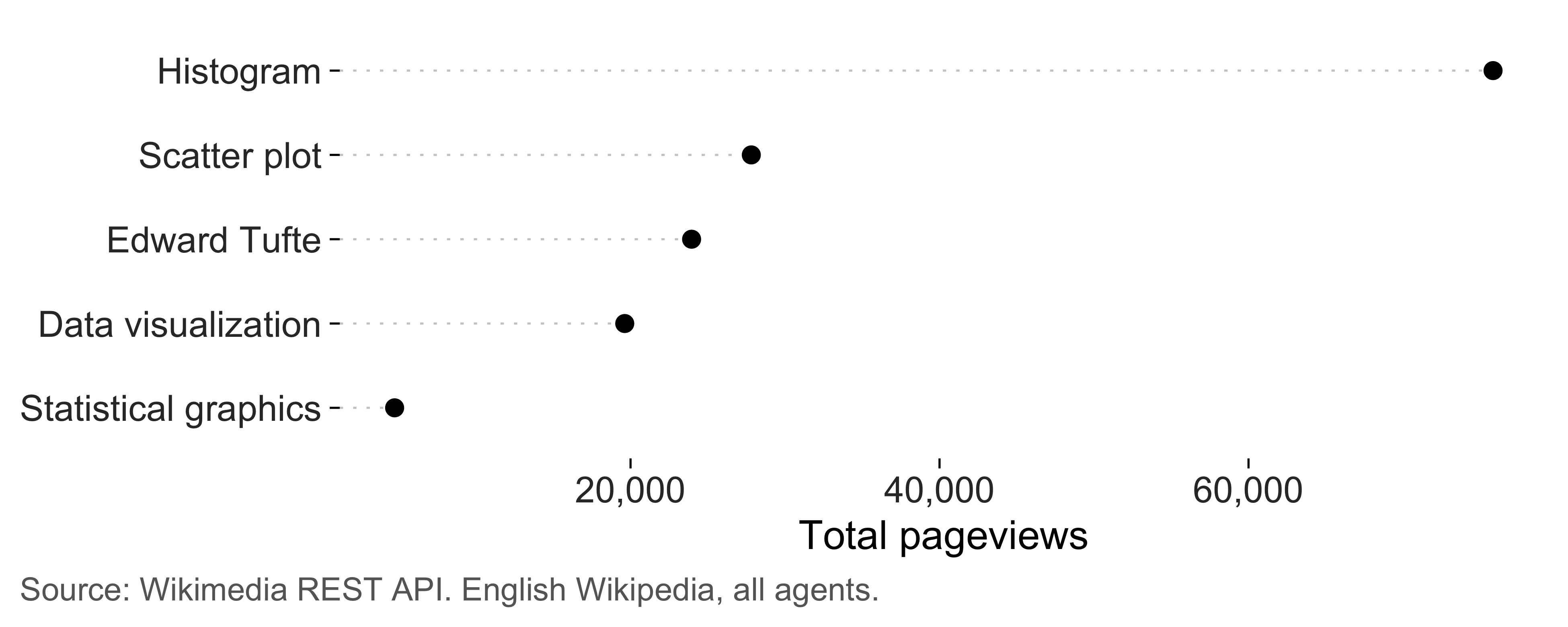
The Histogram article has the most views. I don’t know what explains the difference. Sorting by the totals makes the ordering easy to read.
Small multiples
Here are the same series over time, with a fixed scale across panels so readers can compare their levels.
ggplot(live$pageviews, aes(date, views)) +
  geom_line(linewidth = 0.25, colour = "grey30") +
  geom_rangeframe(sides = "l") +
  facet_tufte(~ article, ncol = 5, labeller = label_wrap_gen(width = 12)) +
  scale_y_continuous(labels = scales::label_comma()) +
  labs(x = NULL, y = "Daily views") +
  theme_tufte() +
  theme(axis.text.x = element_blank(), axis.ticks.x = element_blank()) +
  label_source("Wikimedia REST API")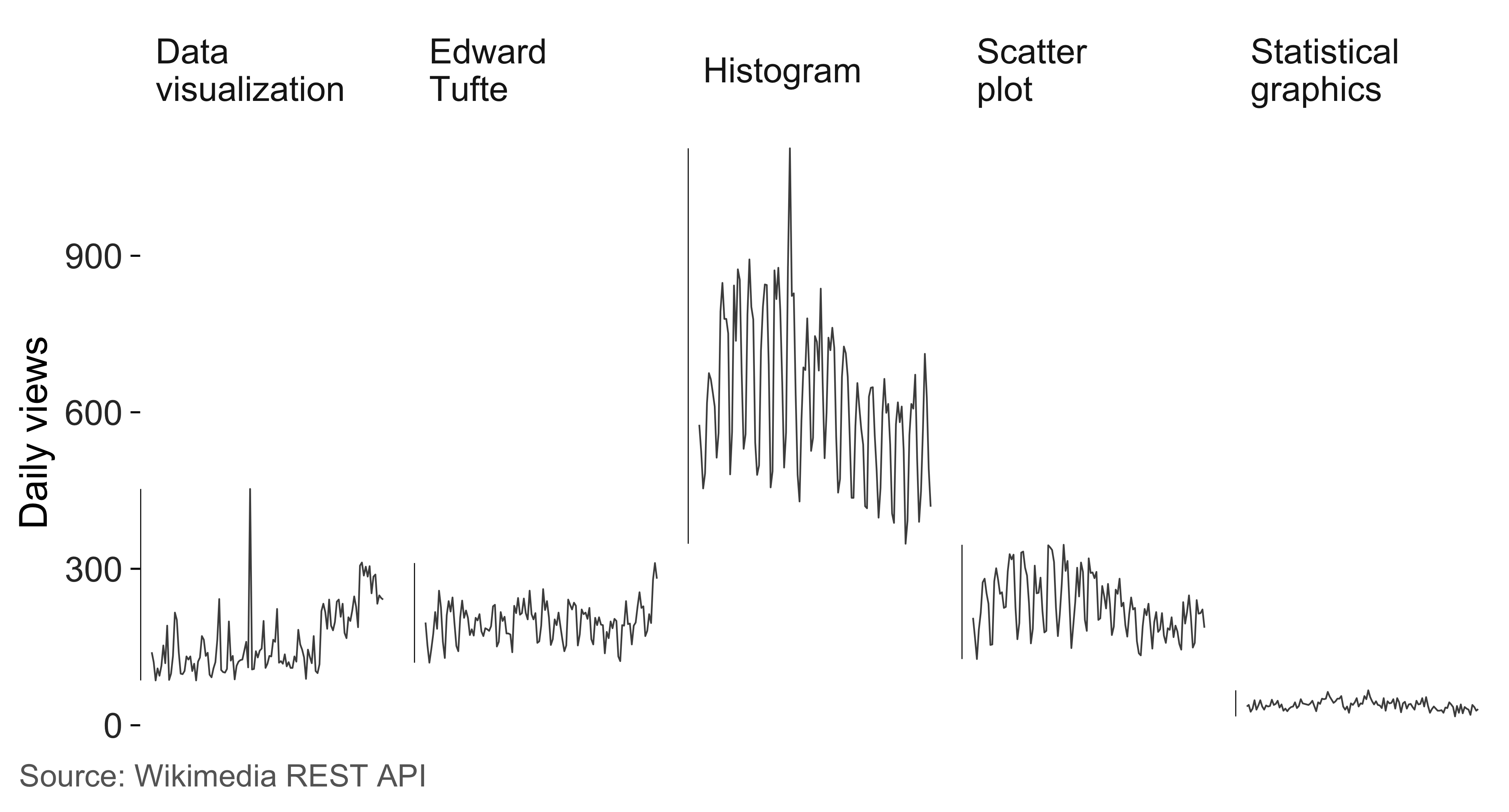
The shared scale makes differences in levels visible, though smaller fluctuations are harder to see. The sparklines above are more useful for examining each series’ pattern.
Auditing a real figure
Here’s the earthquake figure checked at the size I’d print it.
quake_figure <- ggplot(q, aes(depth_km, magnitude)) +
  geom_point(alpha = 0.15, size = 0.7) +
  geom_quartileframe() +
  labs(x = "Depth (km)", y = "Magnitude") +
  theme_tufte() +
  label_source("USGS FDSN event service")

tufte_audit(quake_figure, width = 6.5, height = 4)
#>
#> ── Tufte audit ──
#>
#> At 6.5in x 4in: 1 stated criterion not met.
#>
#> ── Not met
#> ✖ data mark #D8D8D8 has contrast 1.4 against the background, below the
#>   published minimum of 3.0. Try a colour with greater contrast and inspect the
#>   result.
#> Legibility - WCAG 2.1, not Tufte
#>
#> ── Measured, not graded
#> Tufte states a direction for these rather than a threshold. Read them against
#> another draft of the same figure.
#> • Data-ink ratio 0.81: an estimated 81% of the ink comes from data layers.
#>   Compare drafts at the same dimensions; there's no target value.
#> • Data density 824.7 entries per square inch: 15818 estimated entries over 19.2
#>   square inches. Read this alongside the figure and entry count.
#> • 1 distinct colour in use. This is a count, not a verdict on whether the
#>   colours help readers.
#> • One series in one panel. There's no series grouping to separate into small
#>   multiples.
#>
#> ── Met
#> • Panel carries no background fill
#> • No minor gridlines
#> • No full panel border
#> • No pie chart
#> • Lie factor within Tufte's band
#> • No legend to decode
#> • No variable encoded twice
#> • The figure names its source
#> • Wider than it is tall
#> • Measured labels fit at the printed size
The estimated data density is 825 entries per square inch, using 7,909 rows and 2 mapped variables. The measuring article explains how those counts are constructed.
The estimated data-ink ratio is 0.81. Many points overlap here, so their combined ink is counted once. I’d interpret the ratio with that limit in mind.
Contrast, on a figure drawn faintly on purpose
The points use 15 percent opacity to show where observations overlap.
check_contrast() checks the composited colour of an
individual mark against the background. It doesn’t model the darker
areas created by overlapping marks.
check_contrast(quake_figure)
#> # A tibble: 5 × 5
#>   role       colour  ratio threshold passes
#>   <chr>      <chr>   <dbl>     <dbl> <lgl>
#> 1 data mark  #D8D8D8  1.43       3   FALSE
#> 2 caption    grey40   5.74       4.5 TRUE
#> 3 axis text  grey20  12.6        4.5 TRUE
#> 4 data mark  black   21          3   TRUE
#> 5 axis title black   21          4.5 TRUE
An isolated black point at this opacity has a contrast ratio of about 1.4 against white, below the default minimum of 3. That makes individual points hard to distinguish. I’d increase opacity if identifying those points were important, and check a projected version separately.