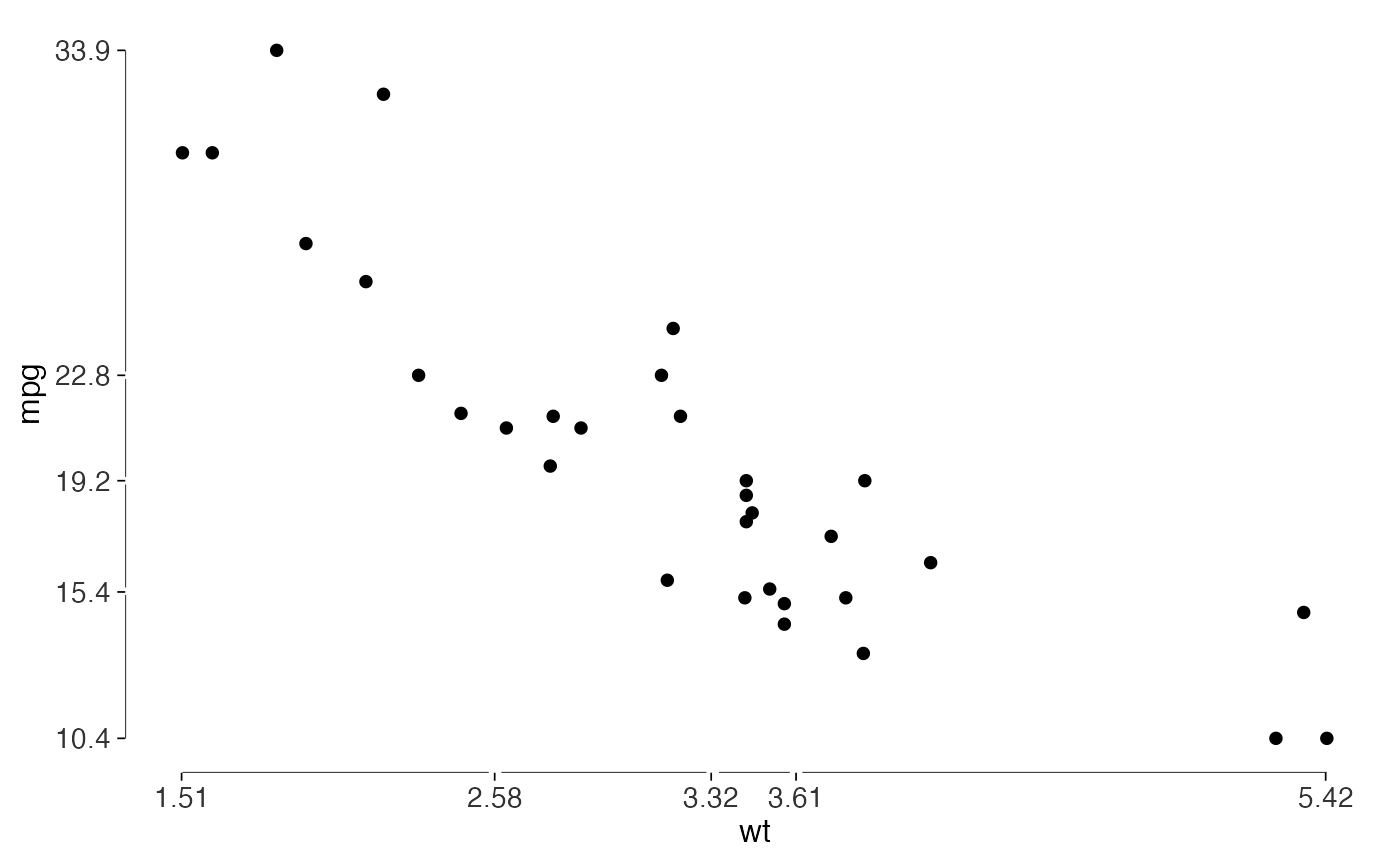
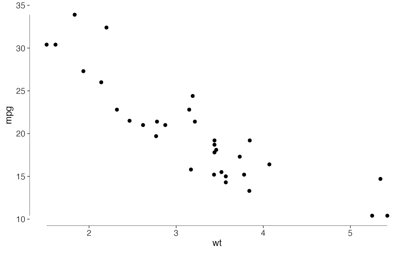
A range frame draws an axis line between the smallest and largest observed values. Tufte's quartile frame adds breaks at the quartiles, so the axis also shows the five-number summary.
Usage
geom_rangeframe(
  mapping = NULL,
  data = NULL,
  stat = "identity",
  position = "identity",
  ...,
  sides = "bl",
  na.rm = FALSE,
  show.legend = NA,
  inherit.aes = TRUE
)

geom_quartileframe(
  mapping = NULL,
  data = NULL,
  stat = "identity",
  position = "identity",
  ...,
  sides = "bl",
  gap = 0.01,
  na.rm = FALSE,
  show.legend = NA,
  inherit.aes = TRUE
)
Arguments
- mapping, data, stat, position, na.rm, show.legend, inherit.aes, ...
Standard
ggplot2layer arguments. Seelayer().- sides
Which axes to draw, as a string containing any of
"b"(bottom),"l"(left),"t"(top) and"r"(right). Defaults to"bl".- gap
For
geom_quartileframe(), the width of the break at each quartile, in npc units of the panel. Defaults to0.01.
Details
Use these with theme_tufte(), which has no axis lines by
default. With another theme, turn off its panel border and axis lines if
you want only the range frame.
See also
quartile_breaks(), which puts the axis labels in the
same places the quartile frame breaks.
Examples
library(ggplot2)
ggplot(mtcars, aes(wt, mpg)) +
geom_point() +
geom_rangeframe() +
theme_tufte()
 ggplot(mtcars, aes(wt, mpg)) +
geom_point() +
geom_quartileframe() +
scale_x_continuous(breaks = quartile_breaks(mtcars$wt)) +
scale_y_continuous(breaks = quartile_breaks(mtcars$mpg)) +
theme_tufte()
ggplot(mtcars, aes(wt, mpg)) +
geom_point() +
geom_quartileframe() +
scale_x_continuous(breaks = quartile_breaks(mtcars$wt)) +
scale_y_continuous(breaks = quartile_breaks(mtcars$mpg)) +
theme_tufte()