Examples with simulated data
Source:vignettes/articles/simulated-examples.Rmd
simulated-examples.RmdHere are examples using simulated data. I’ve used settings familiar from survey experiments and discrimination research, including callback rates and treatment effects across conditions. The numbers are illustrative.
Run the setup and simulation helper before the examples. Each section sets its seed so you can reproduce the figures.
Simulating the data
This helper creates respondents, randomly assigns a condition, and generates an outcome with a modest treatment effect.
simulate_experiment <- function(n = 900,
                                conditions = c("Control", "Information",
                                               "Norms", "Both"),
                                effects = c(0, 0.28, 0.19, 0.41),
                                seed = 20260729) {
  set.seed(seed)
  condition <- factor(sample(conditions, n, replace = TRUE),
                      levels = conditions)
  age <- round(rnorm(n, 46, 15))
  age <- pmin(pmax(age, 18), 85)
  effect <- effects[match(condition, conditions)]

  data.frame(
    id = seq_len(n),
    condition = condition,
    age = age,
    # Outcome on a 1 to 7 scale, with a mild age gradient.
    support = pmin(pmax(
      rnorm(n, 4.1 + effect + 0.012 * (age - 46), 1.15), 1
    ), 7)
  )
}

experiment <- simulate_experiment()
str(experiment)
#> 'data.frame':    900 obs. of  4 variables:
#>  $ id       : int  1 2 3 4 5 6 7 8 9 10 ...
#>  $ condition: Factor w/ 4 levels "Control","Information",..: 1 1 3 3 2 4 2 3 3 4 ...
#>  $ age      : num  43 43 20 51 61 39 35 64 59 29 ...
#>  $ support  : num  3.6 4.55 2.61 1.92 3.37 ...
Distributions: the box plot with the box erased
geom_tufteboxplot() shows the distribution with whisker
lines and a median mark. geom_rangeframe(sides = "l") adds
a vertical axis line spanning the data.
ggplot(experiment, aes(condition, support)) +
  geom_tufteboxplot() +
  geom_rangeframe(sides = "l") +
  labs(
    x = NULL, y = "Support (1-7)",
    title = "Support for the policy, by experimental condition"
  ) +
  theme_tufte() +
  label_source("Simulated data, n = 900")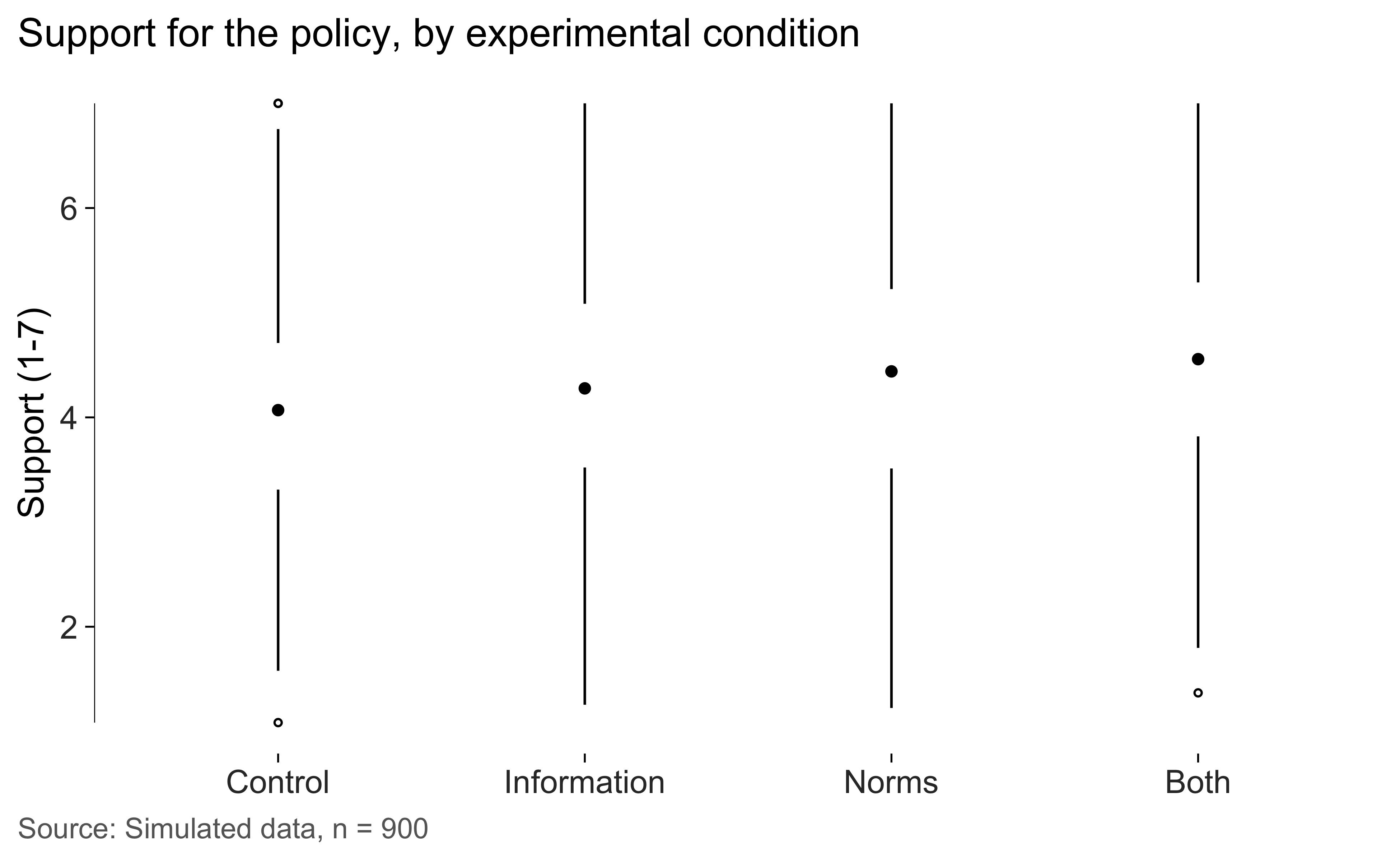
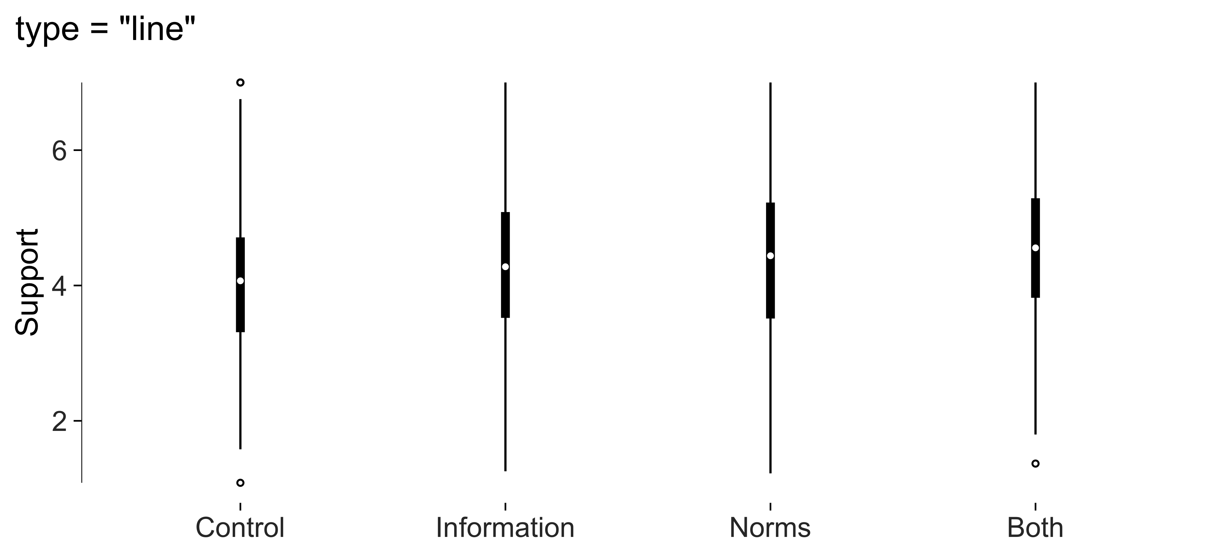
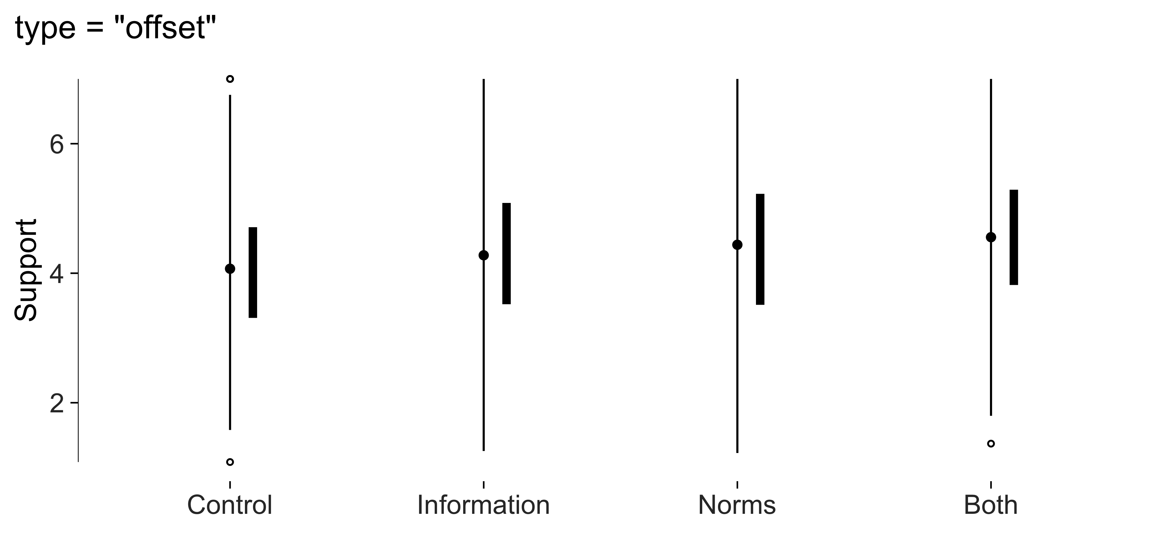
The default, "point", leaves a gap for the interquartile
range and places a dot at the median. "line" uses a thicker
interquartile segment. "offset" places that segment beside
the whiskers. I’d compare them at the size the figure will be
printed.
for (variant in c("line", "offset")) {
  print(
    ggplot(experiment, aes(condition, support)) +
      geom_tufteboxplot(type = variant) +
      geom_rangeframe(sides = "l") +
      labs(x = NULL, y = "Support", title = paste0('type = "', variant, '"')) +
      theme_tufte()
  )
}
Range frames and quartile frames
A range frame spans the observed values. A quartile frame also marks
the five-number summary, with labels supplied by
quartile_breaks().
All five breaks are kept by default. If labels crowd together, use
min_gap to omit some of them. Run
check_labels_fit() and inspect the saved figure.
ggplot(experiment, aes(age, support)) +
  geom_point(alpha = 0.25, size = 1) +
  geom_quartileframe() +
  scale_x_continuous(breaks = quartile_breaks(experiment$age)) +
  scale_y_continuous(breaks = quartile_breaks(experiment$support)) +
  labs(x = "Age", y = "Support") +
  theme_tufte()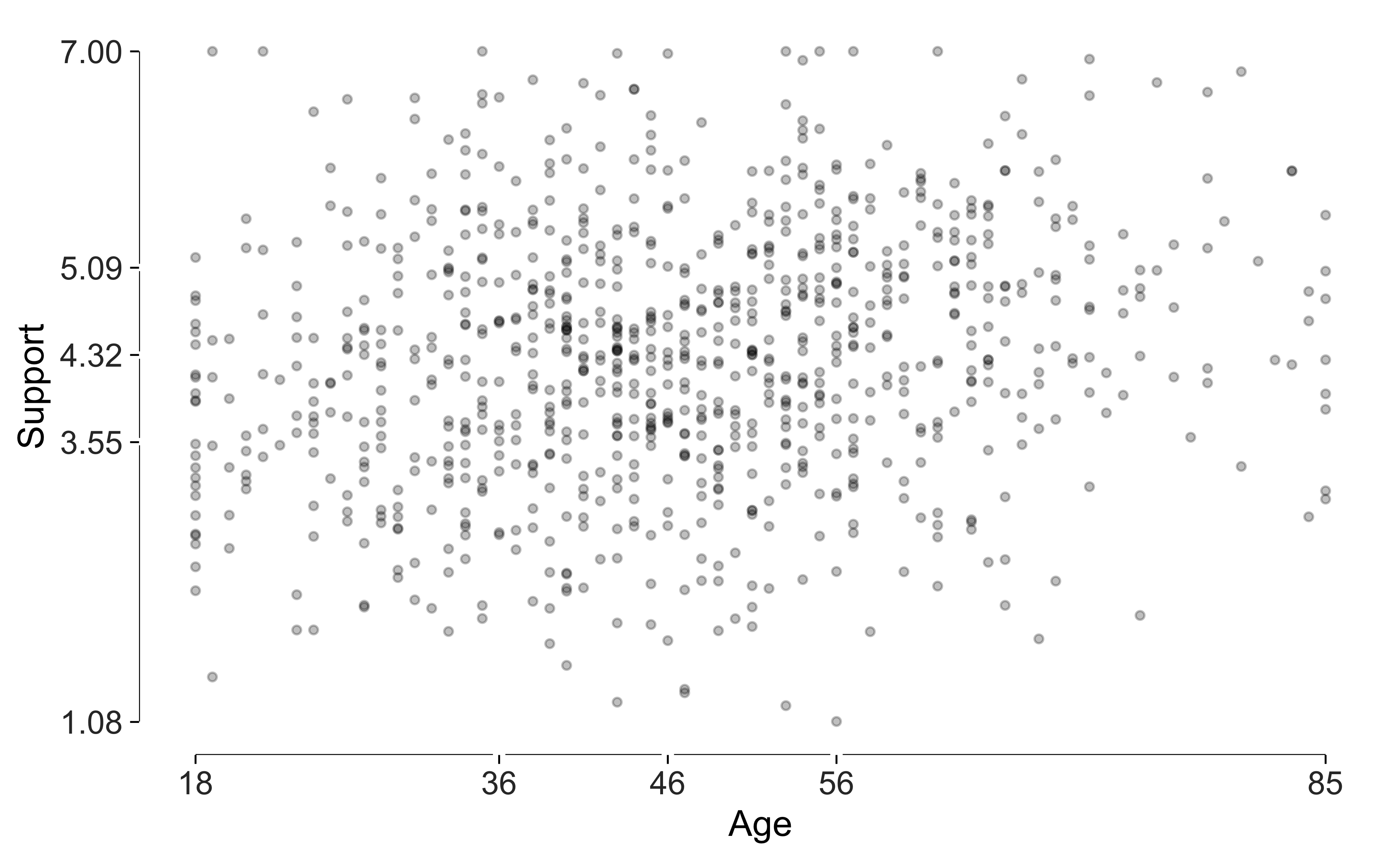
geom_dotdash() adds a short tick for every observation
along each margin. Turn off ordinary theme ticks if you’d like these
marks to replace them.
ggplot(experiment, aes(age, support)) +
  geom_point(alpha = 0.25, size = 1) +
  geom_dotdash() +
  labs(x = "Age", y = "Support") +
  theme_tufte(ticks = FALSE)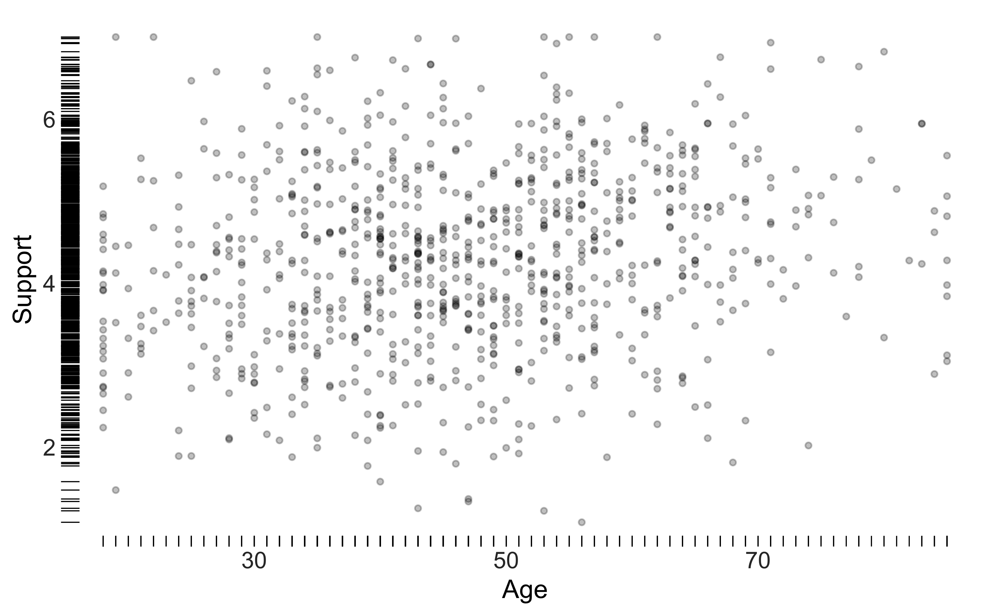
Bars with the gridlines erased through them
This bar design uses gaps through the bars as gridlines. They help readers estimate values without adding a separate grid across the panel.
The example shows simulated callback rates by applicant name and occupation.
set.seed(11)
callbacks <- data.frame(
  name = rep(c("Emily", "Greg", "Lakisha", "Jamal"), each = 2),
  occupation = rep(c("Sales", "Administrative"), 4)
)
callbacks$rate <- round(
  c(10.8, 9.4, 10.2, 9.1, 6.6, 5.9, 6.4, 5.5) + rnorm(8, 0, 0.3), 1
)

ggplot(callbacks, aes(name, rate)) +
  geom_col_tufte(fill = "grey72") +
  facet_tufte(~ occupation) +
  labs(x = NULL, y = "Callback rate (%)",
       title = "Simulated callback rates by name and occupation") +
  theme_tufte() +
  label_source("Simulated data; not real audit-study results")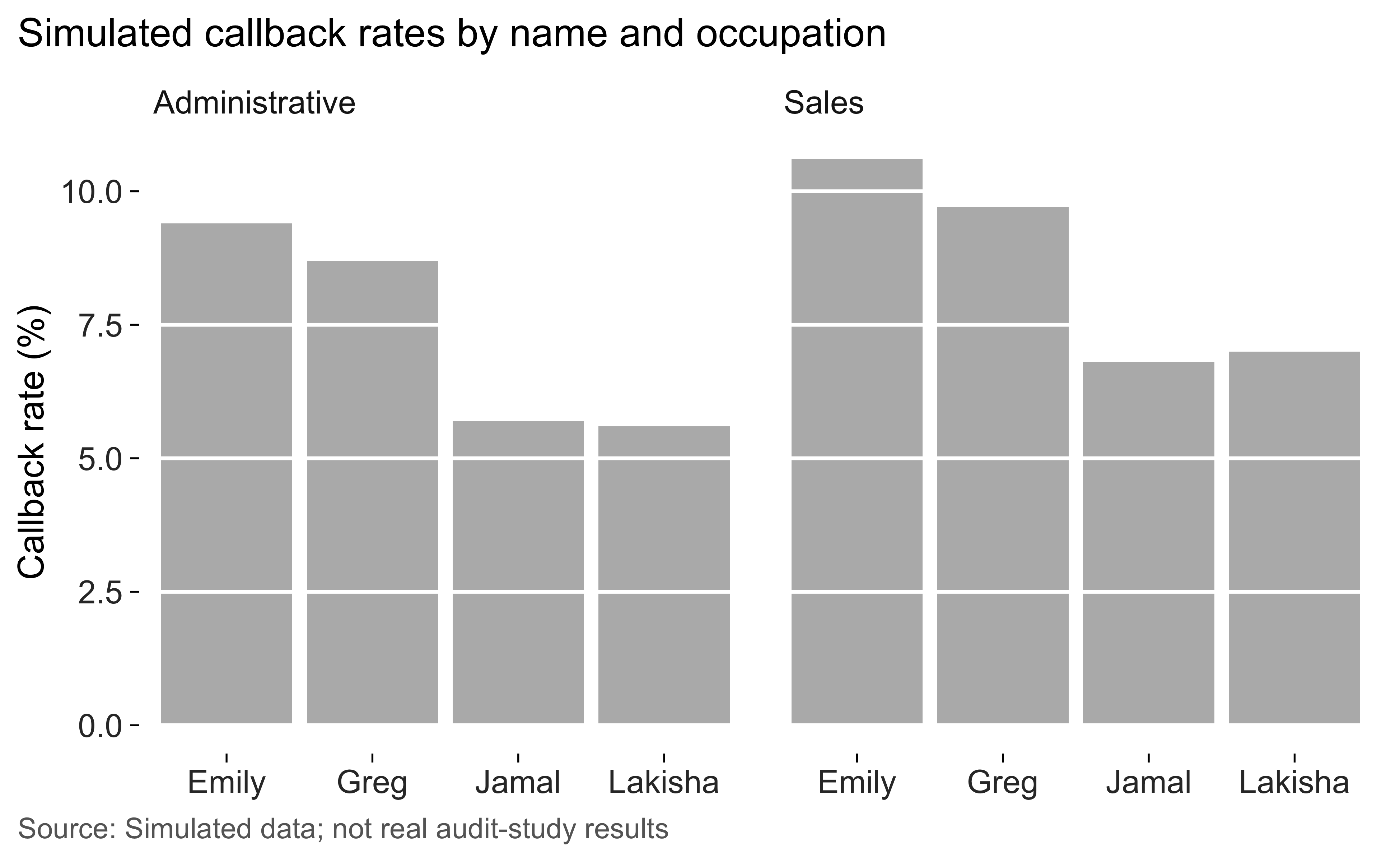
The bars start at zero. tufte_audit() checks the
baseline, and lie_factor() estimates distortion in
supported bar comparisons.
Dots, when a zero baseline isn’t wanted
A dot plot is useful when the values occupy a narrow range far from zero. The dots show position on the scale. Leader lines help readers follow each row to its value.
I’ve sorted the categories by value so rank is easy to see.
support <- aggregate(support ~ condition, experiment, mean)

ggplot(support, aes(support, stats::reorder(condition, support))) +
  geom_cleveland_dot() +
  labs(x = "Mean support (1-7)", y = NULL) +
  theme_tufte() +
  label_source("Simulated data, n = 900")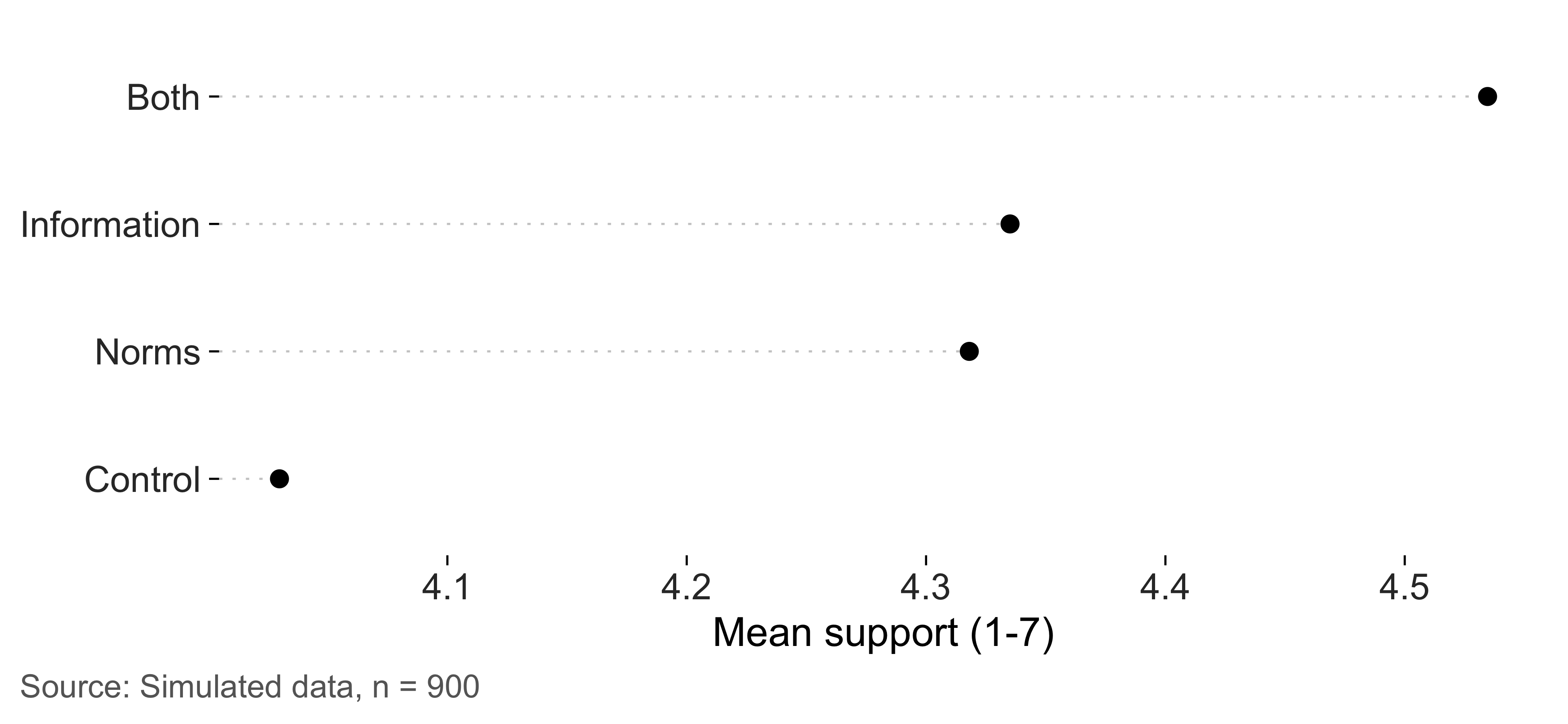
Banking the aspect ratio
The same series looks steeper in a taller panel.
bank_to_45() uses Cleveland’s banking approach to suggest a
height that brings the median absolute slope near 45 degrees.
cycles <- data.frame(
  month = 1:240,
  value = sin(seq(0, 12 * pi, length.out = 240)) + seq(0, 2, length.out = 240)
)

series <- ggplot(cycles, aes(month, value)) +
  geom_line(linewidth = 0.3) +
  geom_rangeframe(sides = "l") +
  labs(x = "Month", y = "Index") +
  theme_tufte()

banked <- bank_to_45(series, width = 6.5)
banked
#>
#> ── Banking to 45 degrees
#> Aspect ratio 0.133 (height / width), from 239 segments by "median_slope".
#> At 6.5in wide, that's a panel 0.86in tall. Allow more for axis labels and
#> titles.
At this height, I find the gradual upward trend easy to see. The individual cycles are compressed.
series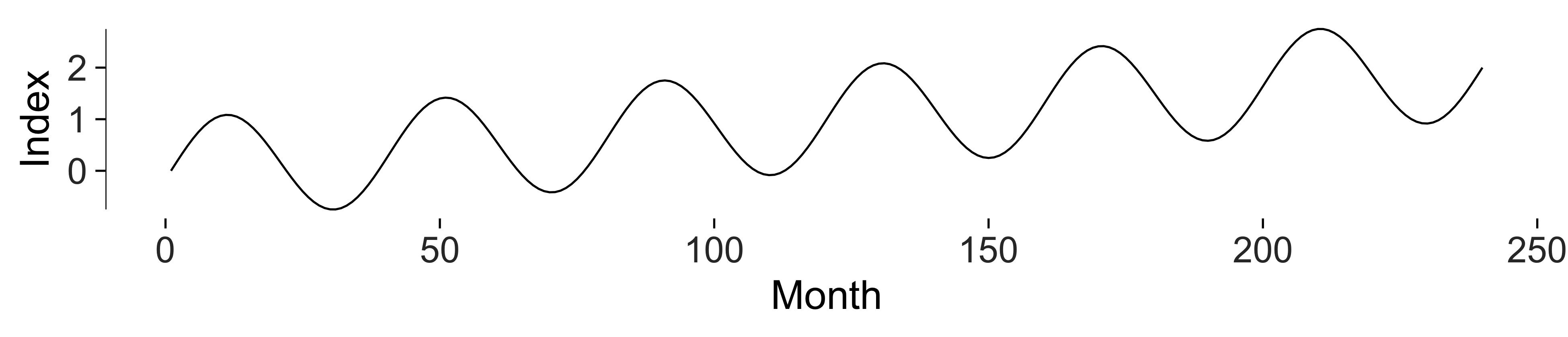
Here’s a taller version. It gives the cycles more space, which may be useful if their pattern is what you want to compare.
series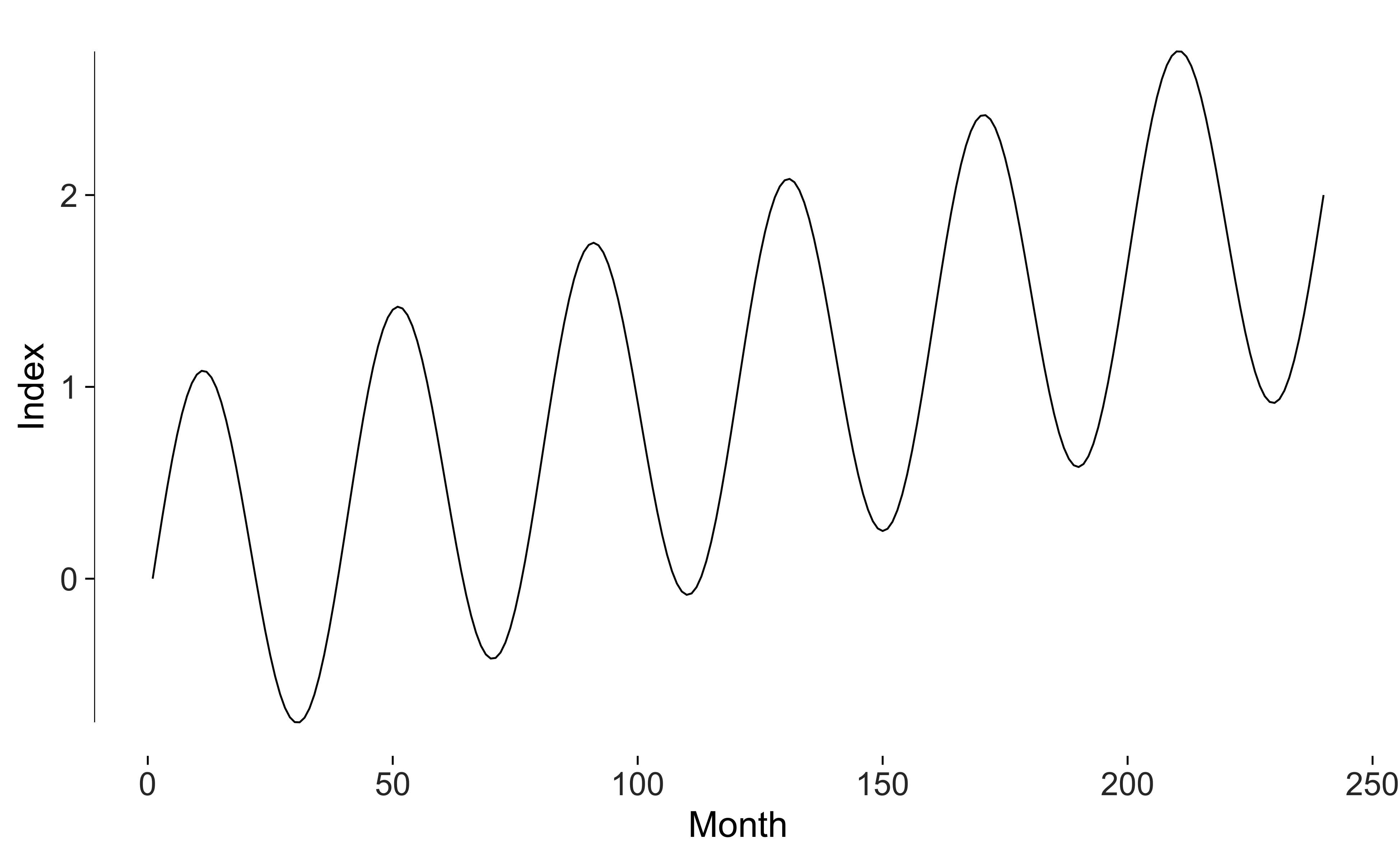
The choice depends on the question. I’d use the suggested height as a starting point and compare it with another version.
Is it dark enough to read?
check_contrast() compares mark and text colours with the
background. Its default minima are 4.5 to 1 for text and 3 to 1 for
marks. It doesn’t resolve every overlapping mark or separately filled
background.
check_contrast(
  ggplot(experiment, aes(age, support)) +
    geom_point(colour = "grey80", size = 0.8) +
    theme_tufte()
)
#> # A tibble: 3 × 5
#>   role       colour ratio threshold passes
#>   <chr>      <chr>  <dbl>     <dbl> <lgl>
#> 1 data mark  grey80  1.61       3   FALSE
#> 2 axis text  grey20 12.6        4.5 TRUE
#> 3 axis title black  21          4.5 TRUE
Grey 80 has low contrast against white. I’d use a darker colour for marks that readers need to distinguish individually.
Small multiples
Repeating the same plot for each condition can make comparisons
easier. facet_tufte() fixes the scales and warns if you
change them.
ggplot(experiment, aes(age, support)) +
  geom_point(alpha = 0.3, size = 0.8) +
  geom_smooth(method = "lm", se = FALSE, colour = "grey20", linewidth = 0.4,
              formula = y ~ x) +
  geom_rangeframe() +
  facet_tufte(~ condition, ncol = 4) +
  labs(x = "Age", y = "Support") +
  theme_tufte()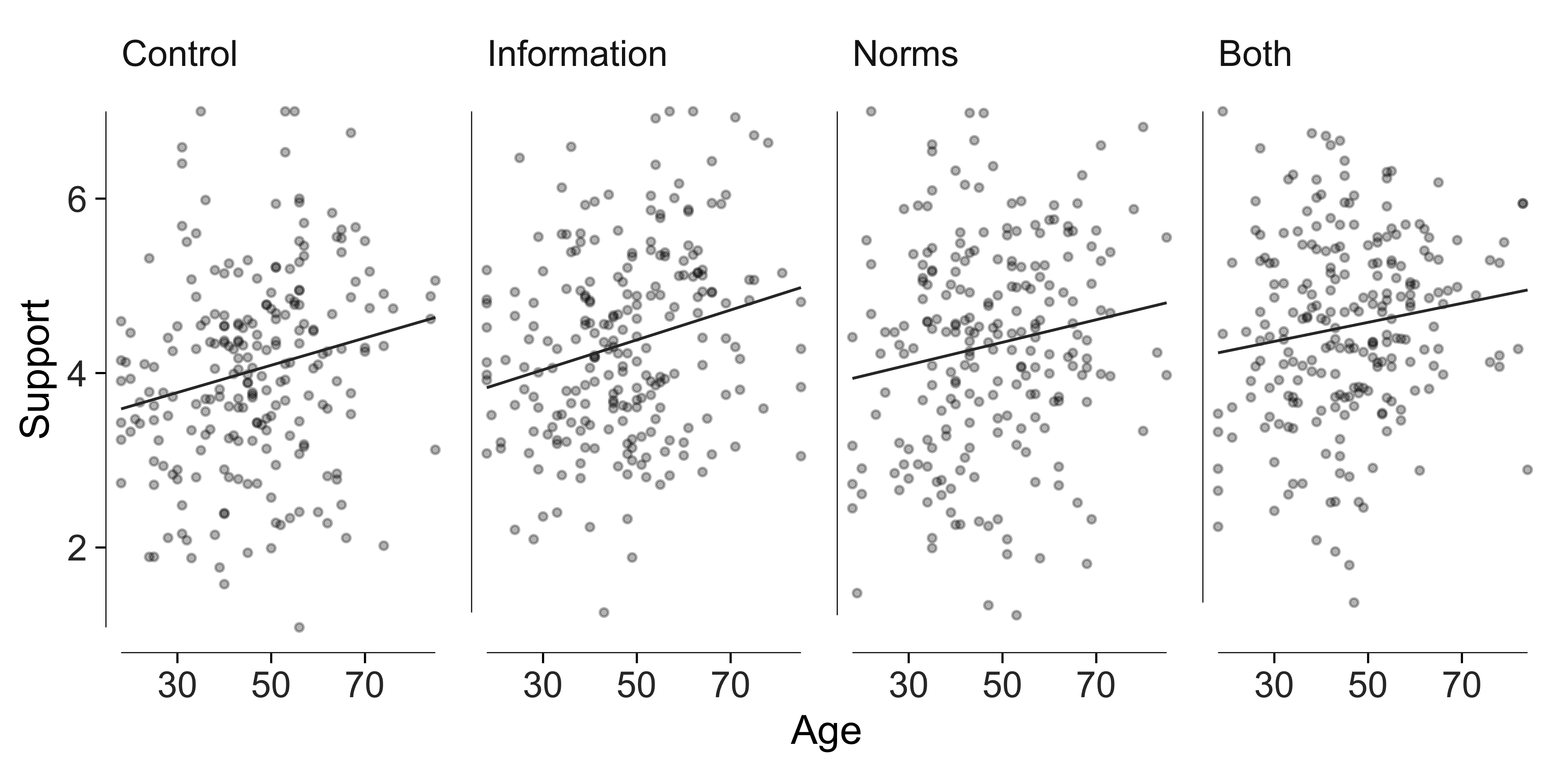
Direct labelling instead of a legend
Put the series name at the end of the line with
geom_text_last(). Readers can then identify a series where
they’re looking at its values.
set.seed(4)
countries <- c("Australia", "Japan", "Korea", "New Zealand")
panel <- do.call(rbind, lapply(seq_along(countries), function(i) {
  data.frame(
    year = 2000:2024,
    country = countries[i],
    trust = cumsum(rnorm(25, 0.1 * (i - 2.5), 1.1)) + 45 + 4 * i
  )
}))

ggplot(panel, aes(year, trust, colour = country)) +
  geom_line(linewidth = 0.4) +
  # Labels take a fixed dark grey rather than the line colour: a label in the
  # lightest grey of a sequential palette is legible as a line and not as text.
  geom_text_last(aes(label = country, group = country), size = 3, colour = "grey15") +
  geom_rangeframe(sides = "l") +
  scale_x_continuous(expand = expansion(mult = c(0.02, 0.18))) +
  scale_colour_tufte("grey") +
  labs(x = NULL, y = "Institutional trust index") +
  theme_tufte() +
  theme(legend.position = "none") +
  label_source("Simulated panel, four countries, 2000-2024")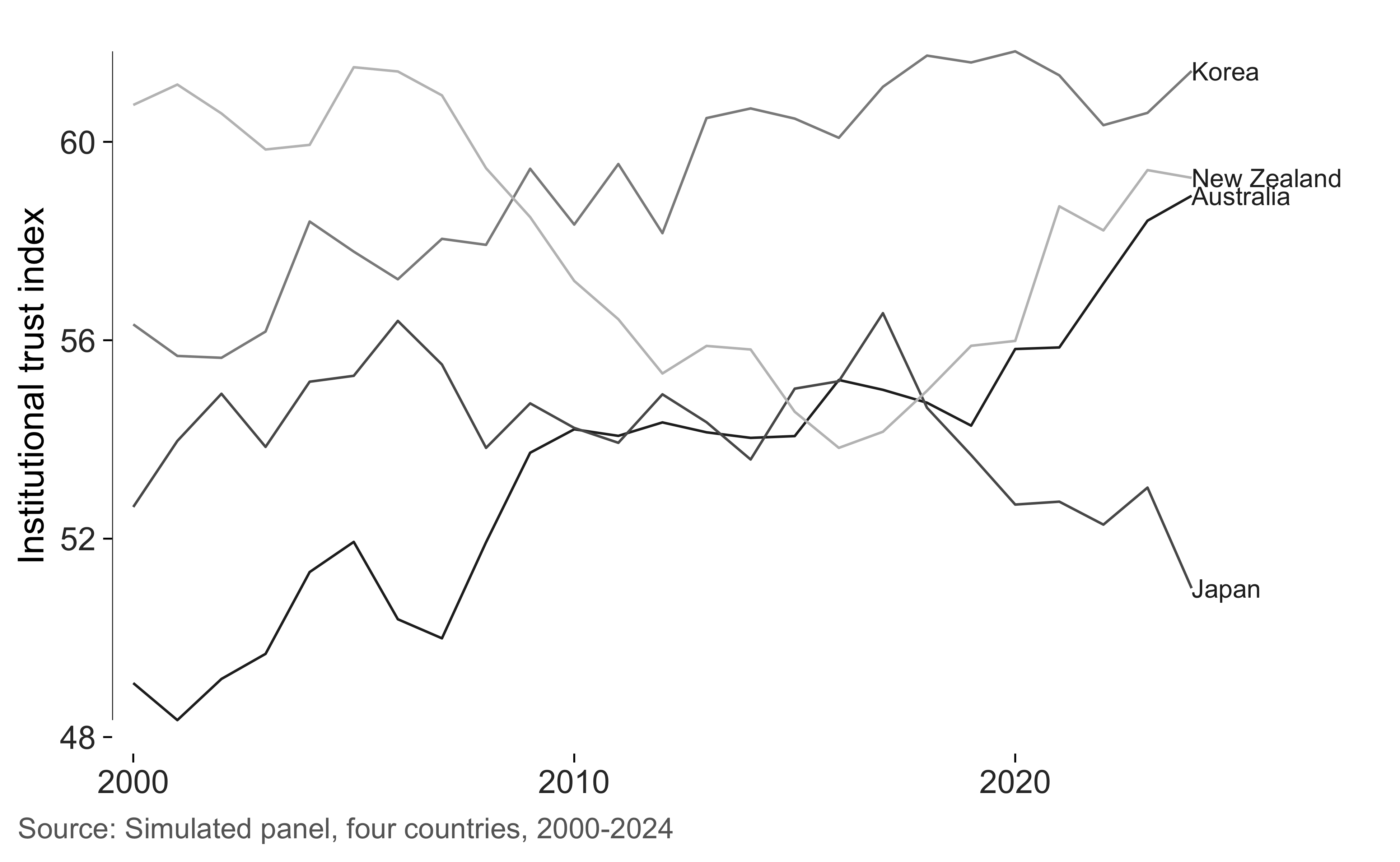
These labels can overlap because geom_text_last()
doesn’t move them apart. Try nudge_y or
ggrepel::geom_text_repel() if the endpoints are close. The
slopegraph function below includes label spacing, though dense plots
still need inspection.
Slopegraphs
A slopegraph compares two periods. The labels give the values and line crossings show changes in rank. I find it useful when both the levels and the changes matter.
set.seed(7)
units <- c("Victoria", "New South Wales", "Queensland", "South Australia",
           "Western Australia", "Tasmania")
before <- round(runif(6, 22, 41), 1)
change <- round(rnorm(6, 3.5, 5), 1)

wave <- data.frame(
  state = rep(units, each = 2),
  wave = rep(c("2015", "2025"), 6),
  value = as.vector(rbind(before, before + change))
)

slopegraph(wave, wave, value, state) +
  scale_x_continuous(breaks = 1:2, labels = c("2015", "2025"),
                     position = "top", expand = expansion(mult = 0.5)) +
  labs(
    title = "Share reporting contact with a migrant neighbour",
    subtitle = "Simulated two-wave panel, percentage points"
  )
#> Scale for x is already present.
#> Adding another scale for x, which will replace the existing scale.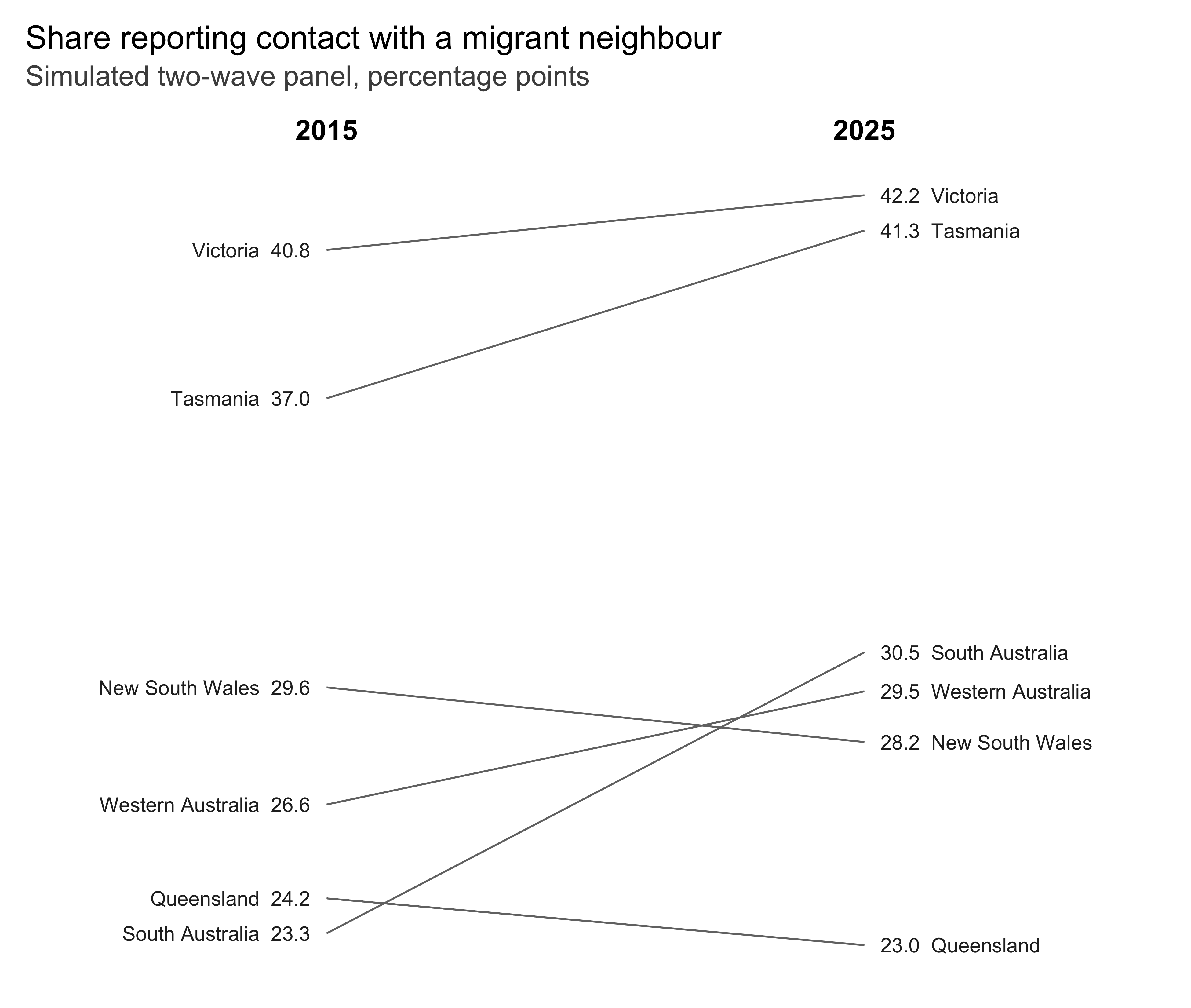
Set direction_colour = TRUE to distinguish increases
from decreases by colour. I’d use that when direction is the comparison
I want to emphasize.
slopegraph(wave, wave, value, state, direction_colour = TRUE) +
  scale_x_continuous(breaks = 1:2, labels = c("2015", "2025"),
                     position = "top", expand = expansion(mult = 0.5))
#> Scale for x is already present.
#> Adding another scale for x, which will replace the existing scale.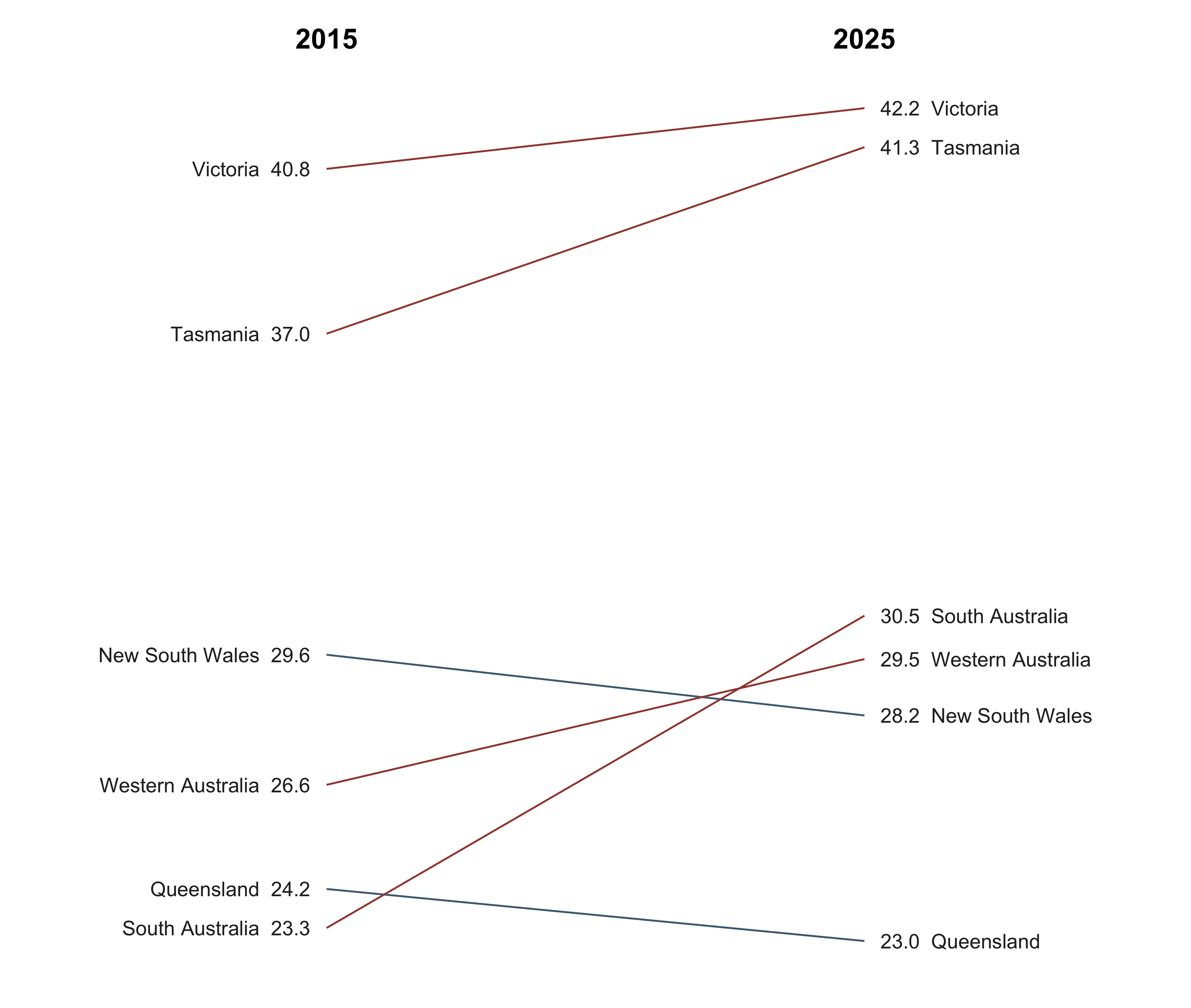
Sparklines
Sparklines fit a series into a small space. Here the band shows its interquartile range and the dots identify the extremes. Each series has its own vertical scale, so compare patterns rather than heights across rows.
set.seed(21)
indicators <- do.call(rbind, lapply(
  c("Turnout", "Trust in parliament", "Union density", "Newspaper readership"),
  function(nm) {
    data.frame(
      quarter = 1:80,
      series = nm,
      value = cumsum(rnorm(80, 0, 1)) + 50
    )
  }
))

sparklines(indicators, quarter, value, series)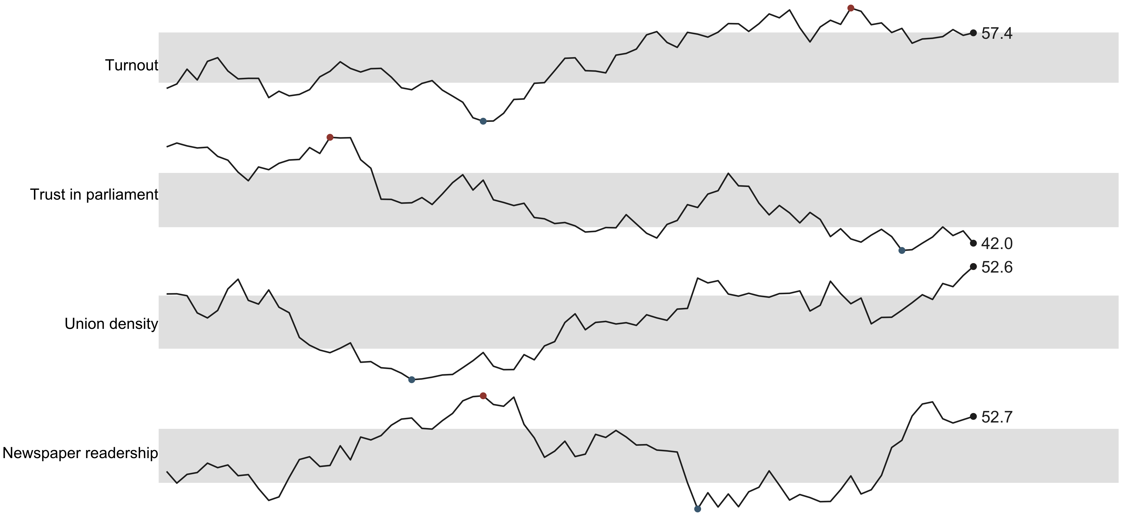
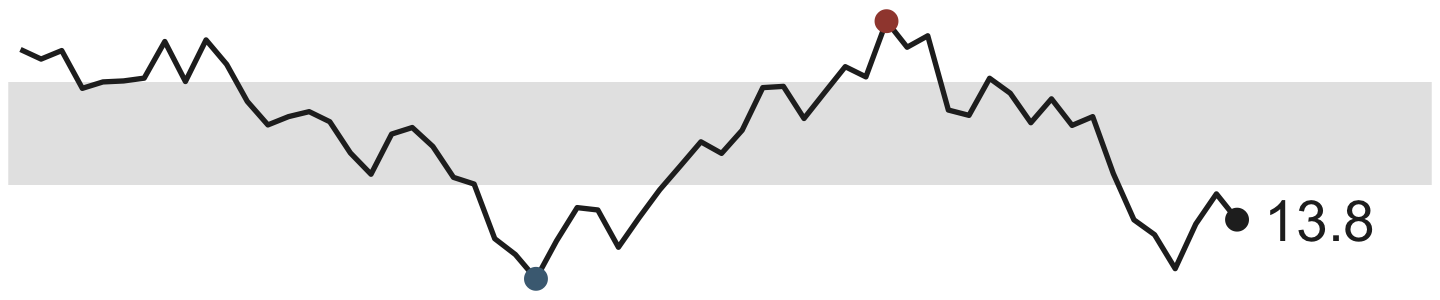
Use sparkline() for one series.
sparkline_grob() returns a grob you can place in a table or
another graphic.
Colour as a code
The palettes serve different uses. "grey" gives an
ordered sequence. "accent" adds one red series to a set of
greys. "muted" uses earth tones, and
"divergent" provides a blue-to-red scale with a neutral
midpoint. Check their contrast in the figure where you’ll use them.
pals <- c("grey", "accent", "muted", "divergent")
swatches <- do.call(rbind, lapply(pals, function(p) {
  cols <- tufte_pal(p)(5)
  data.frame(palette = p, i = seq_along(cols), colour = cols)
}))

ggplot(swatches, aes(i, palette, fill = colour)) +
  geom_tile(colour = "white", linewidth = 2) +
  scale_fill_identity() +
  labs(x = NULL, y = NULL) +
  theme_tufte(ticks = FALSE) +
  theme(axis.text.x = element_blank())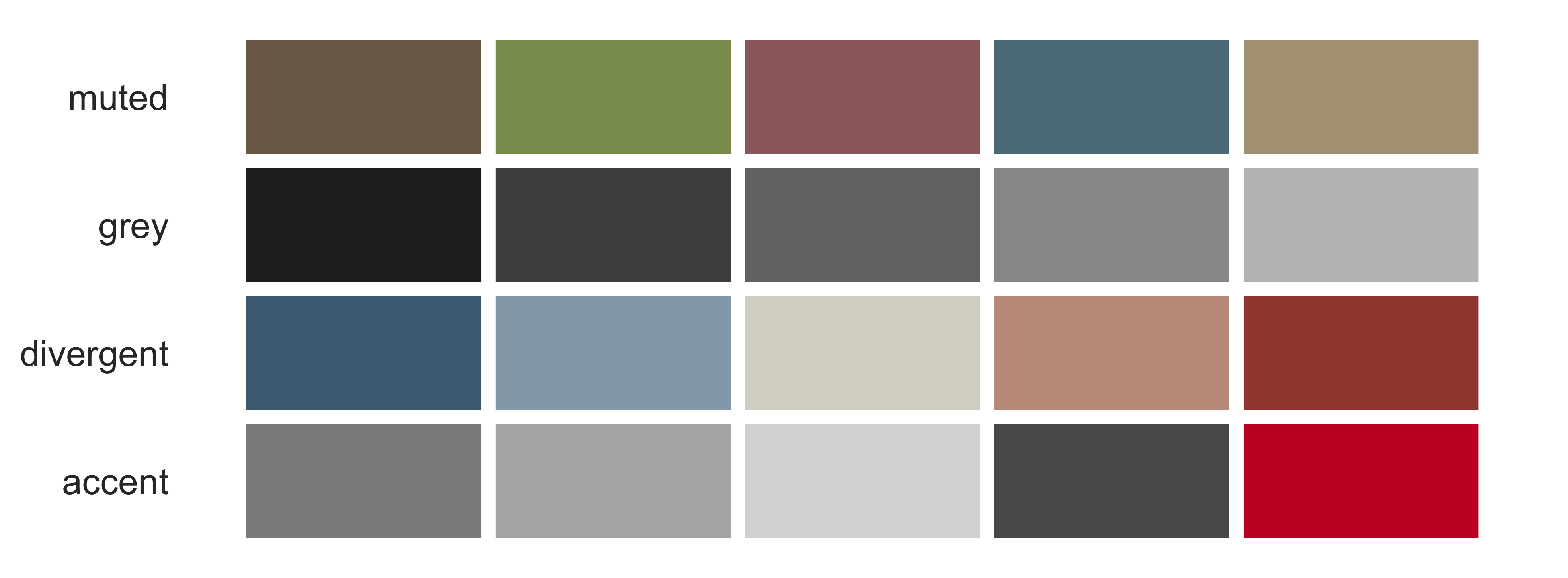
Here I’ve used grey for the comparison series and an accent for the one I want readers to notice.
focus <- panel
focus$highlight <- ifelse(focus$country == "Korea", "Korea", "Other")

ggplot(focus, aes(year, trust, group = country, colour = highlight)) +
  geom_line(linewidth = 0.4) +
  geom_rangeframe(sides = "l") +
  scale_colour_manual(values = c(Korea = "#c8102e", Other = "#bfbfbf")) +
  geom_text_last(
    data = subset(focus, country == "Korea"),
    aes(label = country), size = 3, colour = "#c8102e"
  ) +
  scale_x_continuous(expand = expansion(mult = c(0.02, 0.1))) +
  labs(x = NULL, y = "Institutional trust index") +
  theme_tufte() +
  theme(legend.position = "none")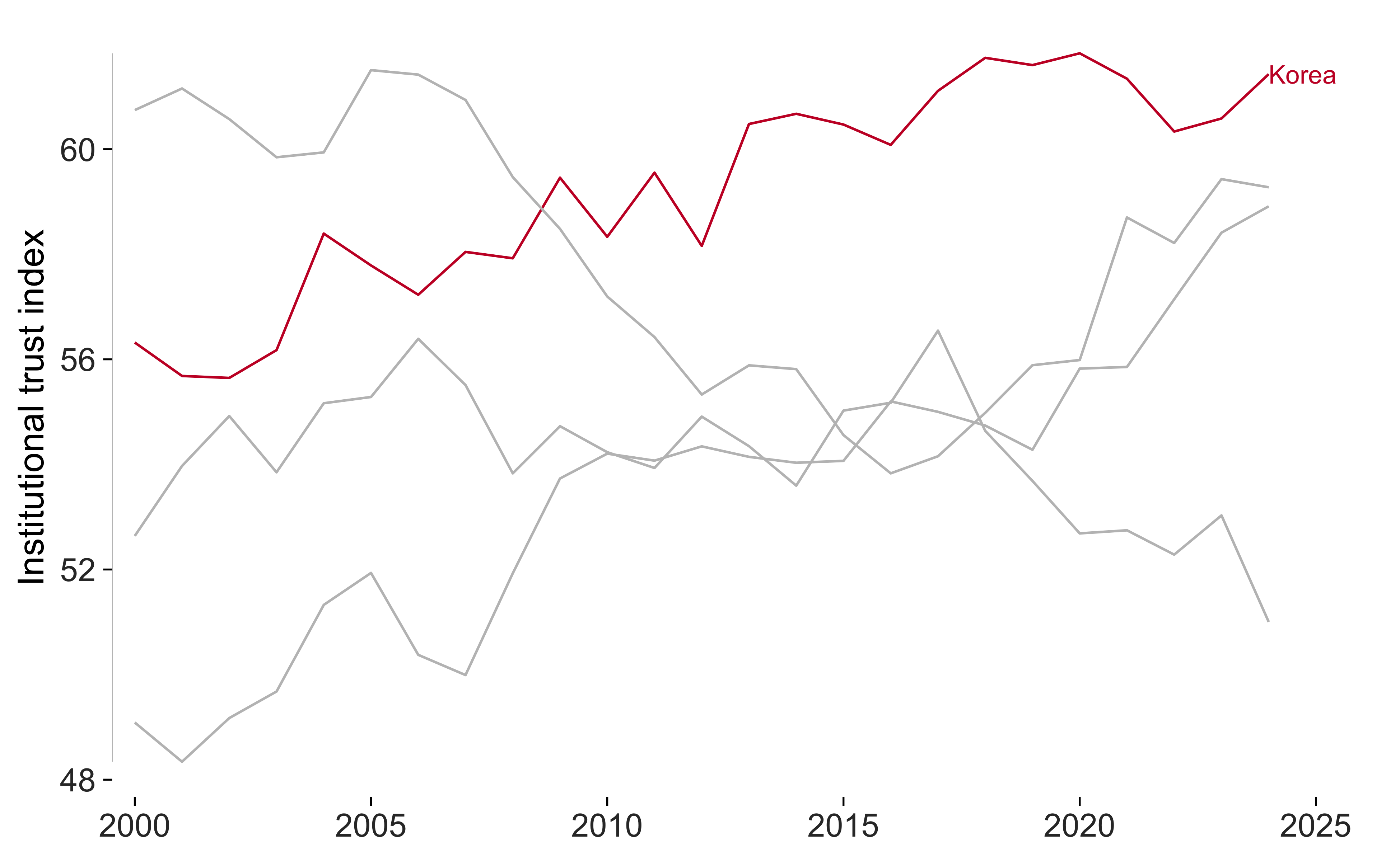
Auditing the result
tufte_audit() checks the available criteria and reports
measurements that you can compare across drafts.
final <- ggplot(experiment, aes(condition, support)) +
  geom_tufteboxplot() +
  geom_rangeframe(sides = "l") +
  labs(x = NULL, y = "Support (1-7)") +
  theme_tufte() +
  label_source("Simulated data, n = 900")

tufte_audit(final, width = 6.5, height = 4)
#>
#> ── Tufte audit ──
#>
#> At 6.5in x 4in: 0 stated criteria not met.
#>
#> ── Measured, not graded
#> Tufte states a direction for these rather than a threshold. Read them against
#> another draft of the same figure.
#> • Data-ink ratio 0.52: an estimated 52% of the ink comes from data layers.
#>   Compare drafts at the same dimensions; there's no target value.
#> • Data density 88.3 entries per square inch: 1800 estimated entries over 20.4
#>   square inches. Read this alongside the figure and entry count.
#> • 1 distinct colour in use. This is a count, not a verdict on whether the
#>   colours help readers.
#> • One series in one panel. There's no series grouping to separate into small
#>   multiples.
#>
#> ── Met
#> • Panel carries no background fill
#> • No minor gridlines
#> • No full panel border
#> • No pie chart
#> • Lie factor within Tufte's band
#> • No legend to decode
#> • No variable encoded twice
#> • The figure names its source
#> • Wider than it is tall
#> • Ink clears the WCAG contrast minimum
#> • Measured labels fit at the printed size
The measuring article explains how the estimates work and where they need careful interpretation.