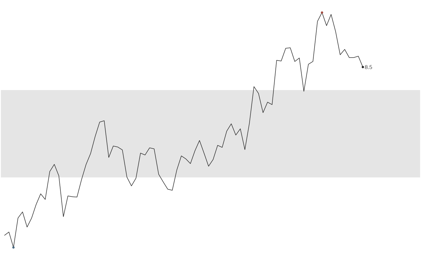
Draw a time series small enough to place in a sentence, table cell, or margin. Tufte describes these word-sized graphics in Beautiful Evidence.
Arguments
- values
Numeric vector of values, in order.
- index
Optional numeric vector of positions. Defaults to
seq_along(values).- band
Either
NULLfor no band, or a length-2 numeric vector of quantiles defining the normal range. Defaults toc(0.25, 0.75).- band_fill
Fill colour of the normal-range band.
- extremes
Logical. Mark the minimum and maximum with dots?
- last_point
Logical. Mark the final value with a dot?
- label
Logical. Print the final value at the right-hand end?
- accuracy
Rounding for the printed value, passed to
label_number(). Defaults to0.1; use1for counts.- big.mark
Thousands separator for the printed value. Defaults to a comma, since the scales default is a space and reads oddly at sparkline size.
- colour
Line colour. Defaults to a near-black grey.
- linewidth
Line width. Defaults to
0.3, a hairline.- extreme_colours
Length-2 vector of colours for the minimum and maximum dots.
Details
The default grey band marks the interquartile range. Dots identify the minimum and maximum, and a label gives the final value. There are no axes, so make sure the surrounding text supplies the context readers need.
See also
sparklines() for many series at once,
sparkline_grob() to embed one in other graphics.