
How can we make a figure easier to read? I built tufter
to try some of the ideas in Tufte’s The Visual Display of
Quantitative Information and examine what changes. It provides
plotting tools and estimates of data-ink ratio, lie factor and data
density.
The audit checks explicit criteria and reports the other measurements without a pass or fail. I’ve kept those separate because Tufte doesn’t give every principle a numerical target. There’s no overall score.
Start with a default plot
Here’s a scatterplot using the defaults in ggplot2.
base <- ggplot(mtcars, aes(wt, mpg)) +
  geom_point()

base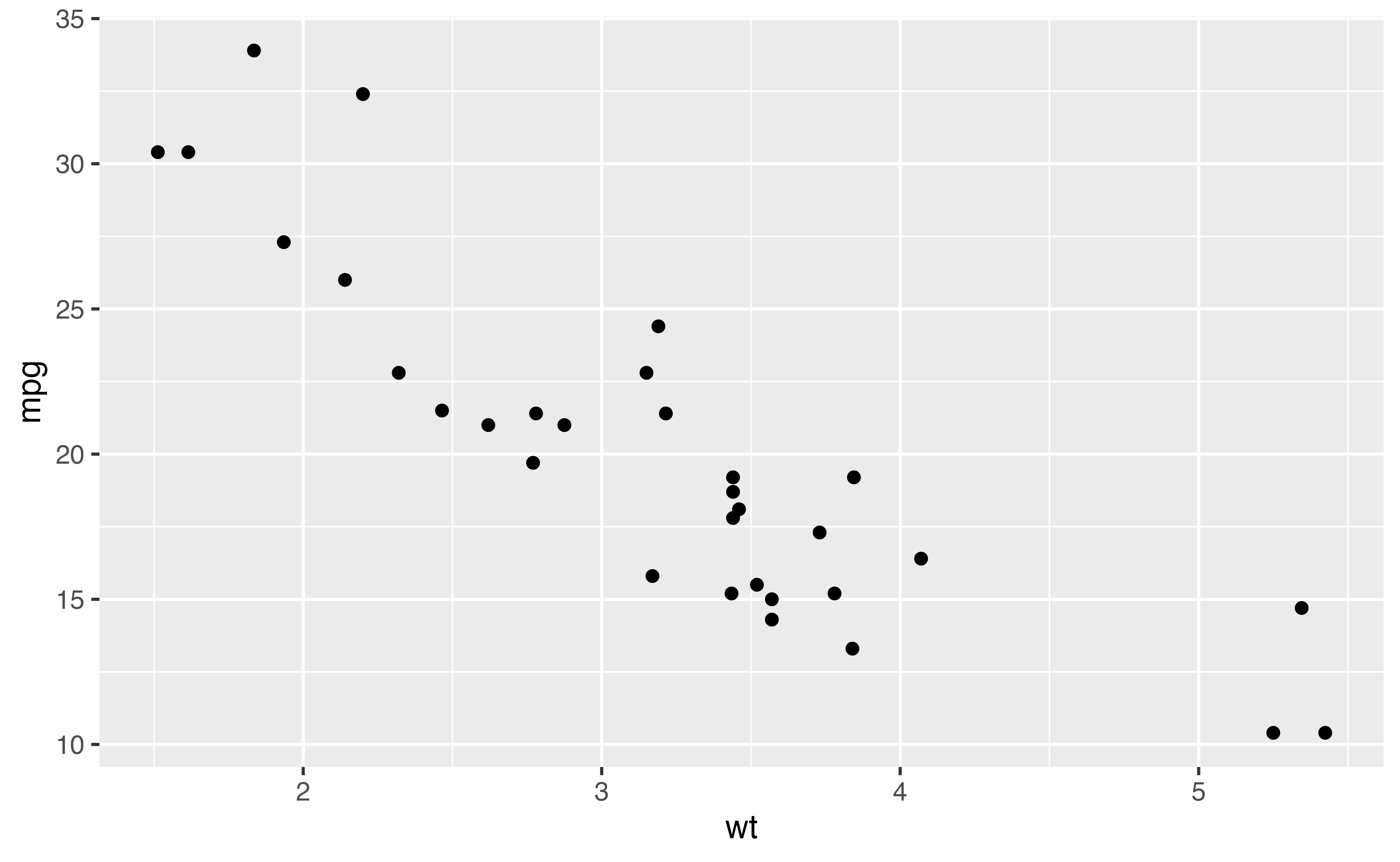
We can estimate how much of its ink comes from the data layers.
data_ink_ratio(base)
#>
#> ── Data-ink ratio
#> 6% of the ink in this figure varies with the data.
#> • data ink: 2102 pixel-equivalents
#> • non-data ink: 35581
#> • measured at 6.5in x 4in, 150 dpi
The estimate counts the panel background and grid as non-data ink. That helps explain the low ratio, though it doesn’t tell us whether those elements help a reader.
Erase, then replace the frame
theme_tufte() removes the background, grid and border.
Adding geom_rangeframe() draws an axis line between the
smallest and largest observed values.
lean <- base +
  geom_rangeframe() +
  theme_tufte()

lean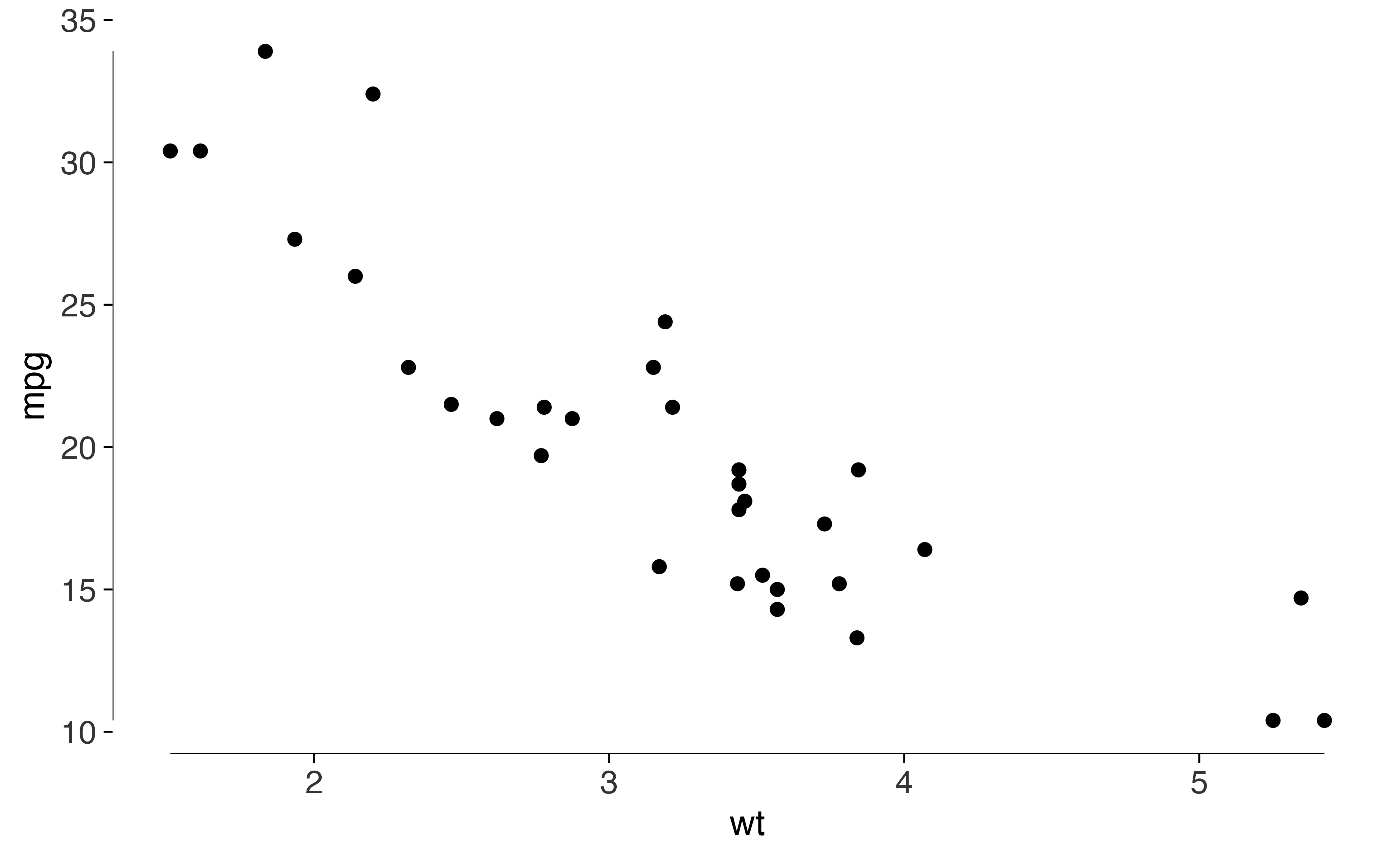
data_ink_ratio(lean)
#>
#> ── Data-ink ratio
#> 74% of the ink in this figure varies with the data.
#> • data ink: 3549 pixel-equivalents
#> • non-data ink: 1245
#> • measured at 6.5in x 4in, 150 dpi
A quartile frame also marks the five-number summary. Pair
geom_quartileframe() with quartile_breaks() to
put labels at those values.
base +
  geom_quartileframe() +
  scale_x_continuous(breaks = quartile_breaks(mtcars$wt)) +
  scale_y_continuous(breaks = quartile_breaks(mtcars$mpg)) +
  theme_tufte()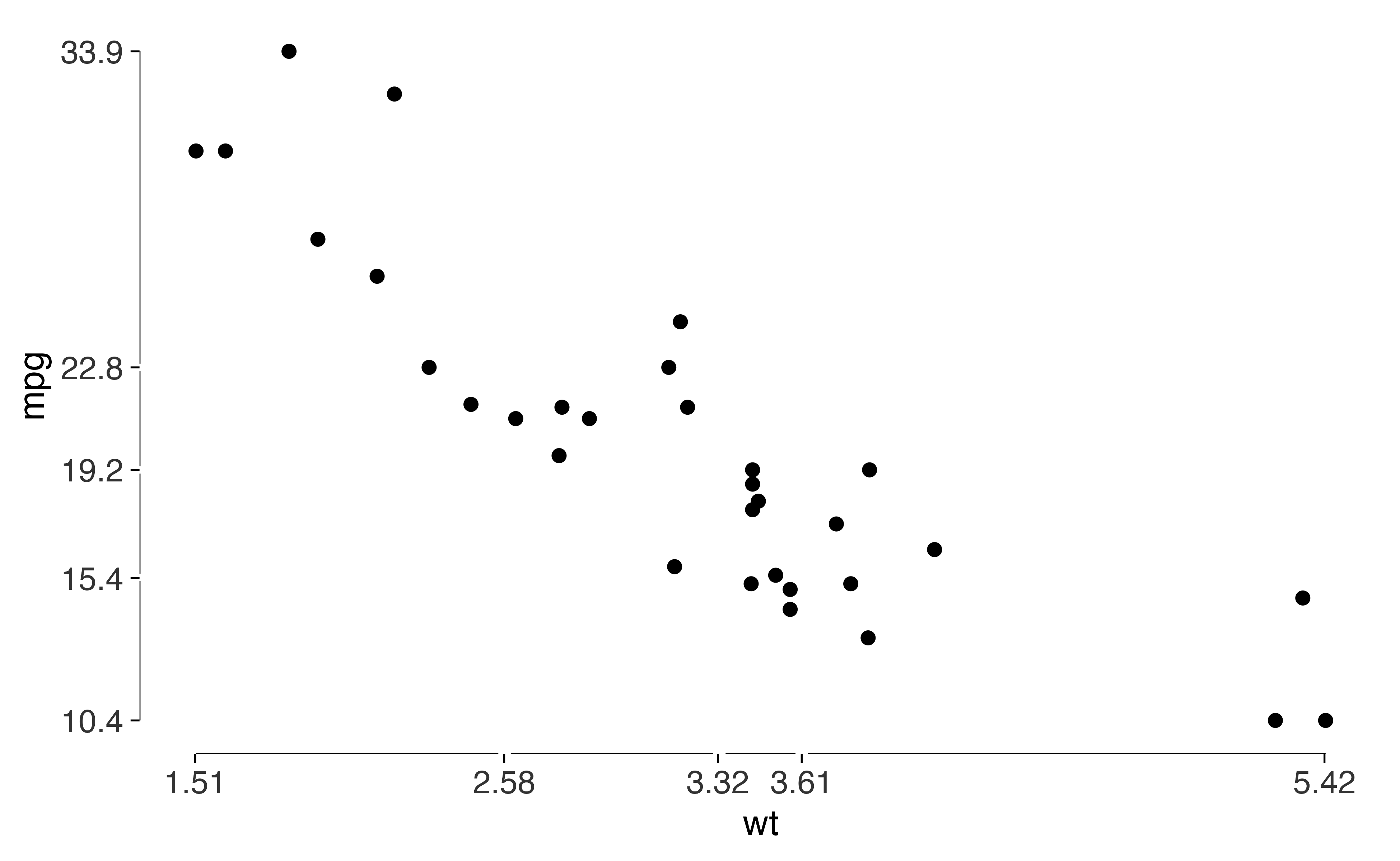
The audit
tufte_audit() lists unmet criteria with their sources.
It also reports measurements that you can compare with another version
of the figure.
tufte_audit(lean, width = 6.5, height = 4)
#>
#> ── Tufte audit ──
#>
#> At 6.5in x 4in: 1 stated criterion not met.
#>
#> ── Not met
#> ✖ No caption is present. Add the data source with label_source() so readers can
#>   check where the numbers came from.
#> Documentation - Beautiful Evidence ch. 6
#>
#> ── Measured, not graded
#> Tufte states a direction for these rather than a threshold. Read them against
#> another draft of the same figure.
#> • Data-ink ratio 0.74: an estimated 74% of the ink comes from data layers.
#>   Compare drafts at the same dimensions; there's no target value.
#> • Data density 3.2 entries per square inch: 64 estimated entries over 20.1
#>   square inches. Read this alongside the figure and entry count.
#> • 1 distinct colour in use. This is a count, not a verdict on whether the
#>   colours help readers.
#> • One series in one panel. There's no series grouping to separate into small
#>   multiples.
#>
#> ── Met
#> • Panel carries no background fill
#> • No minor gridlines
#> • No full panel border
#> • No pie chart
#> • Lie factor within Tufte's band
#> • No legend to decode
#> • No variable encoded twice
#> • Wider than it is tall
#> • Ink clears the WCAG contrast minimum
#> • Measured labels fit at the printed size
This version still needs a data source. Add one with
label_source().
tufte_audit(lean + label_source("Motor Trend, 1974"), width = 6.5, height = 4)
#>
#> ── Tufte audit ──
#>
#> At 6.5in x 4in: 0 stated criteria not met.
#>
#> ── Measured, not graded
#> Tufte states a direction for these rather than a threshold. Read them against
#> another draft of the same figure.
#> • Data-ink ratio 0.66: an estimated 66% of the ink comes from data layers.
#>   Compare drafts at the same dimensions; there's no target value.
#> • Data density 3.4 entries per square inch: 64 estimated entries over 18.9
#>   square inches. Read this alongside the figure and entry count.
#> • 1 distinct colour in use. This is a count, not a verdict on whether the
#>   colours help readers.
#> • One series in one panel. There's no series grouping to separate into small
#>   multiples.
#>
#> ── Met
#> • Panel carries no background fill
#> • No minor gridlines
#> • No full panel border
#> • No pie chart
#> • Lie factor within Tufte's band
#> • No legend to decode
#> • No variable encoded twice
#> • The figure names its source
#> • Wider than it is tall
#> • Ink clears the WCAG contrast minimum
#> • Measured labels fit at the printed size
The data-ink ratio and data density are reported without grades. I’d compare them across drafts and ask whether the change makes the figure more useful. A higher value isn’t sufficient reason to prefer a design.
The audit can flag a missing source or a truncated label. It can’t assess whether the figure supports your argument.
Graphical integrity
Truncating a bar chart’s baseline changes the proportions shown by
its bars. lie_factor() measures that distortion for
supported bar charts.
d <- data.frame(president = c("Bush", "Obama"), growth = c(100, 110))

honest <- ggplot(d, aes(president, growth)) + geom_col()
truncated <- honest + coord_cartesian(ylim = c(95, 115))

lie_factor(honest)
#> [1] 1
lie_factor(truncated)
#> [1] 16.66667
Here the displayed proportional change is much larger than the change in the data. Tufte’s reference band is roughly 0.95 to 1.05.
You can also supply numeric vectors, as in the fuel-economy example from The Visual Display. The function compares proportional changes in the values and in the marks used to draw them.
lie_factor(c(18.0, 27.5), c(0.6, 5.3))
#> [1] 14.84211
Bars with the gridlines erased
Gridlines can help readers estimate bar heights. Tufte’s version draws them as gaps through the bars. Here’s how that looks.
d <- data.frame(
  crop = c("Wheat", "Maize", "Rice", "Barley", "Oats"),
  yield = c(3.5, 5.8, 4.6, 3.1, 2.5)
)

ggplot(d, aes(crop, yield)) +
  geom_col_tufte(fill = "grey72") +
  labs(x = NULL, y = "Tonnes per hectare") +
  theme_tufte()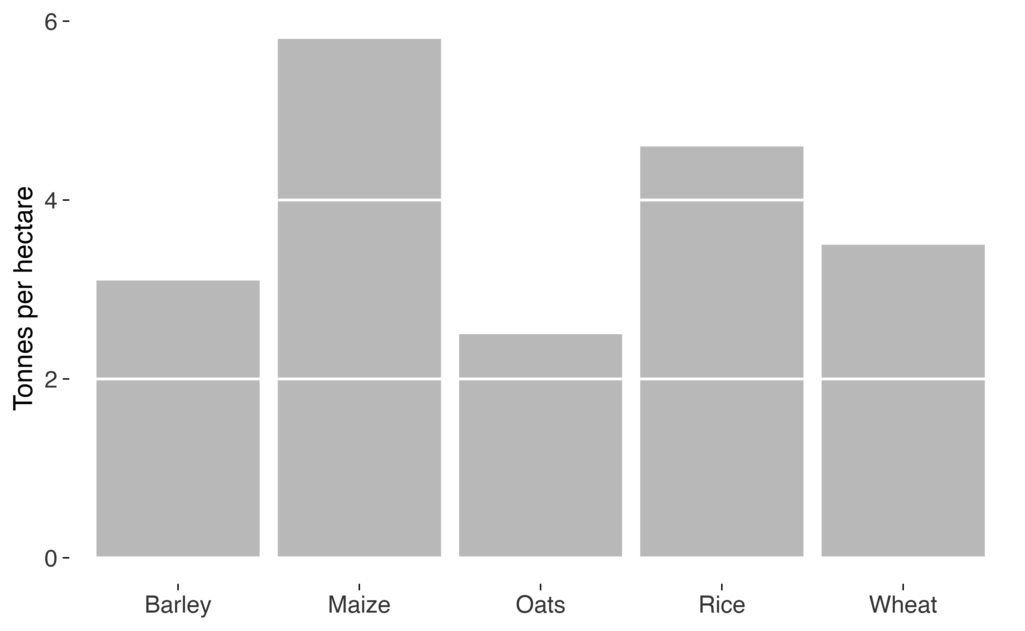
Box plots without the box
This version uses whisker lines and a median dot, with a gap for the interquartile range.
ggplot(mtcars, aes(factor(cyl), mpg)) +
  geom_tufteboxplot() +
  geom_rangeframe(sides = "l") +
  labs(x = "Cylinders", y = "Miles per gallon") +
  theme_tufte()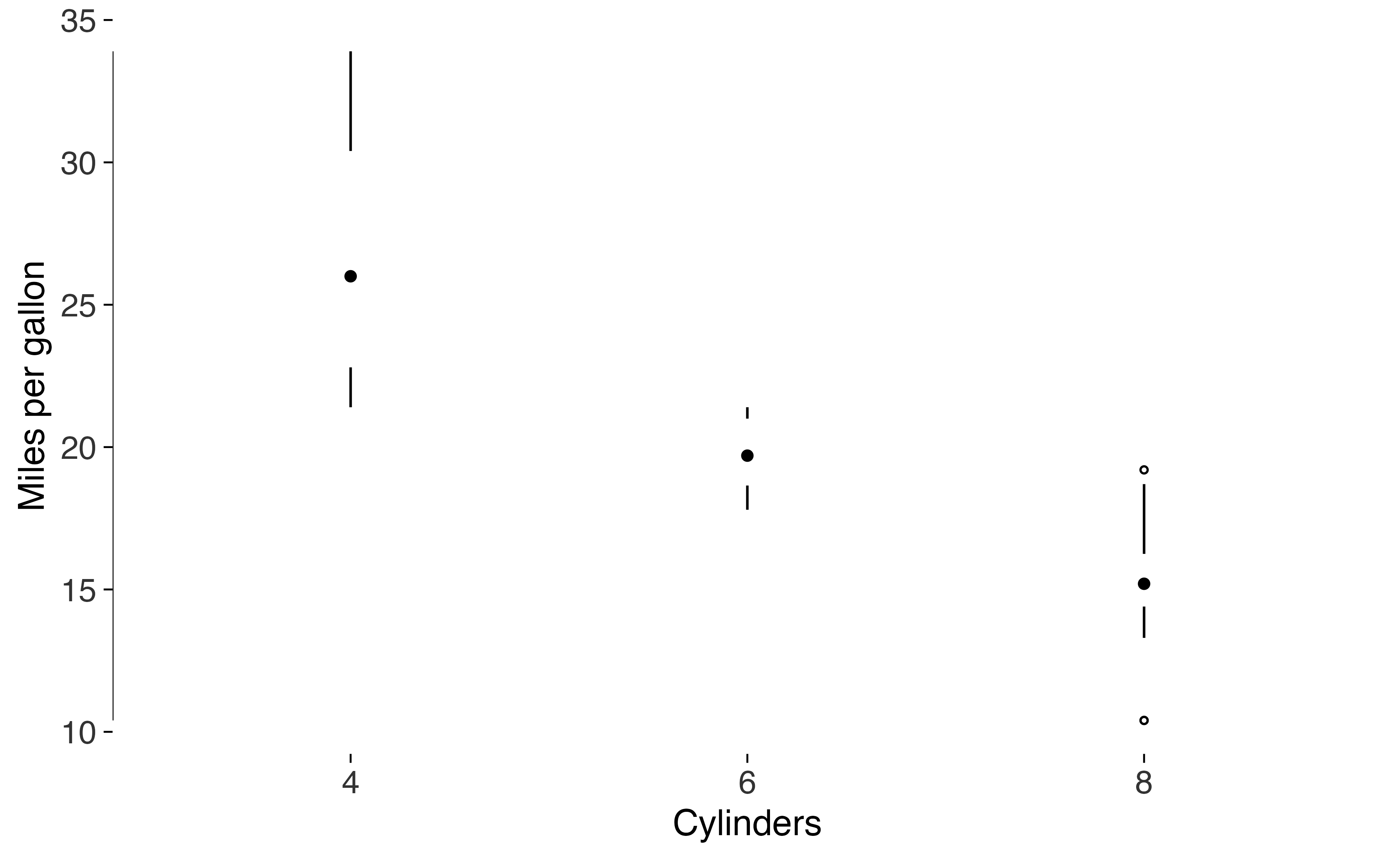
Try type = "line" or type = "offset" if the
interquartile range needs a more visible mark.
Labels on the data
I often prefer putting a series name beside its line.
geom_text_last() labels the final point so readers don’t
have to look up a legend.
series <- data.frame(
  year = rep(2000:2015, 3),
  value = c(cumsum(rnorm(16)), cumsum(rnorm(16)) + 4, cumsum(rnorm(16)) - 4),
  crop = rep(c("Wheat", "Maize", "Rice"), each = 16)
)

ggplot(series, aes(year, value, colour = crop)) +
  geom_line(linewidth = 0.4) +
  geom_text_last(aes(label = crop), size = 3) +
  scale_x_continuous(expand = expansion(mult = c(0.02, 0.12))) +
  scale_colour_tufte("grey") +
  theme_tufte() +
  theme(legend.position = "none")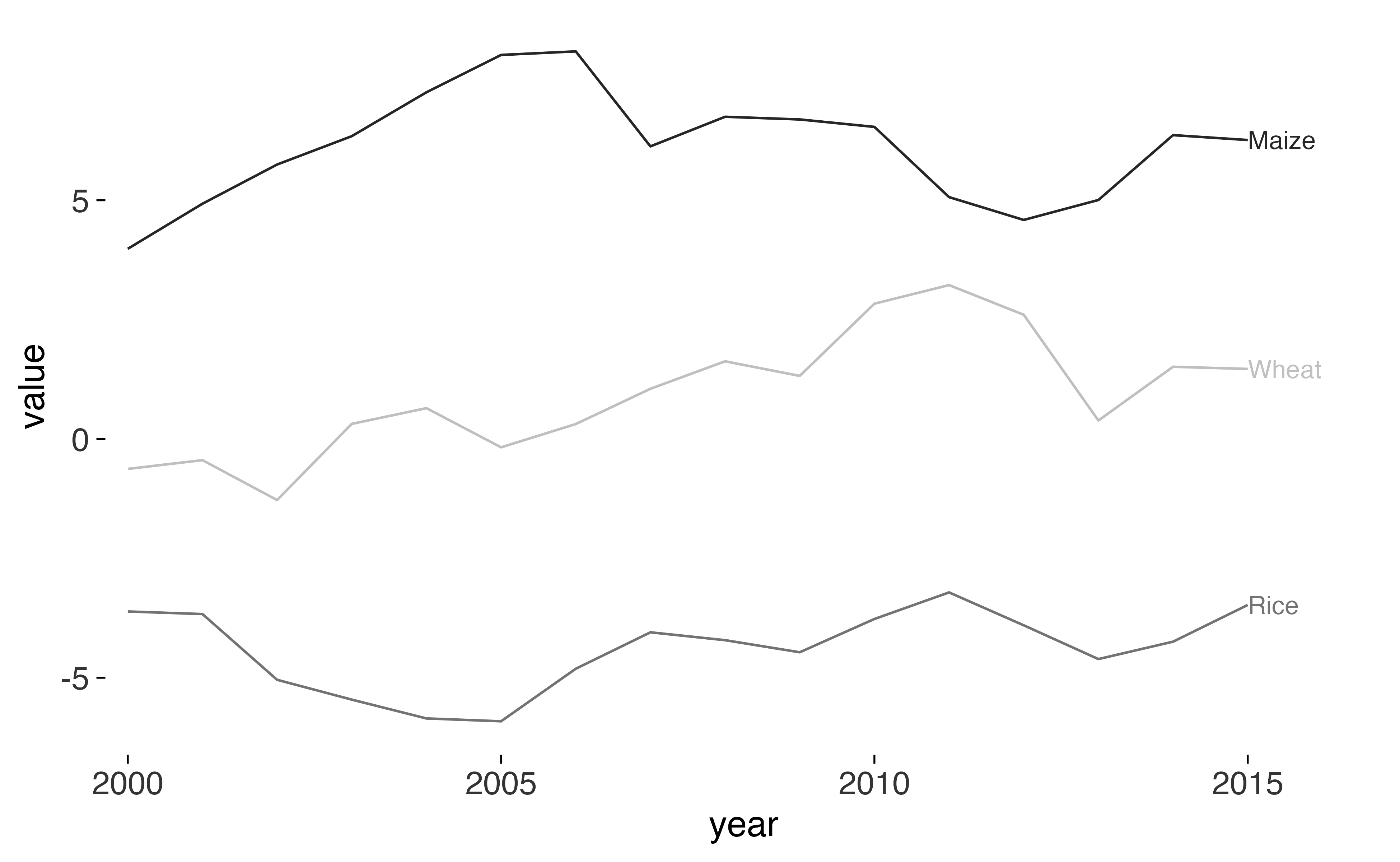
Slopegraphs
A slopegraph compares two periods. The lines show changes in values and rank, and labels give the numbers at each end.
d <- data.frame(
  country = rep(c("Sweden", "Japan", "Chile", "Canada", "Greece"), each = 2),
  year = rep(c("1970", "2020"), 5),
  spending = c(30.1, 41.2, 20.7, 32.9, 22.5, 21.0, 31.0, 38.4, 25.2, 29.7)
)

slopegraph(d, year, spending, country) +
  labs(title = "Public spending as a share of GDP")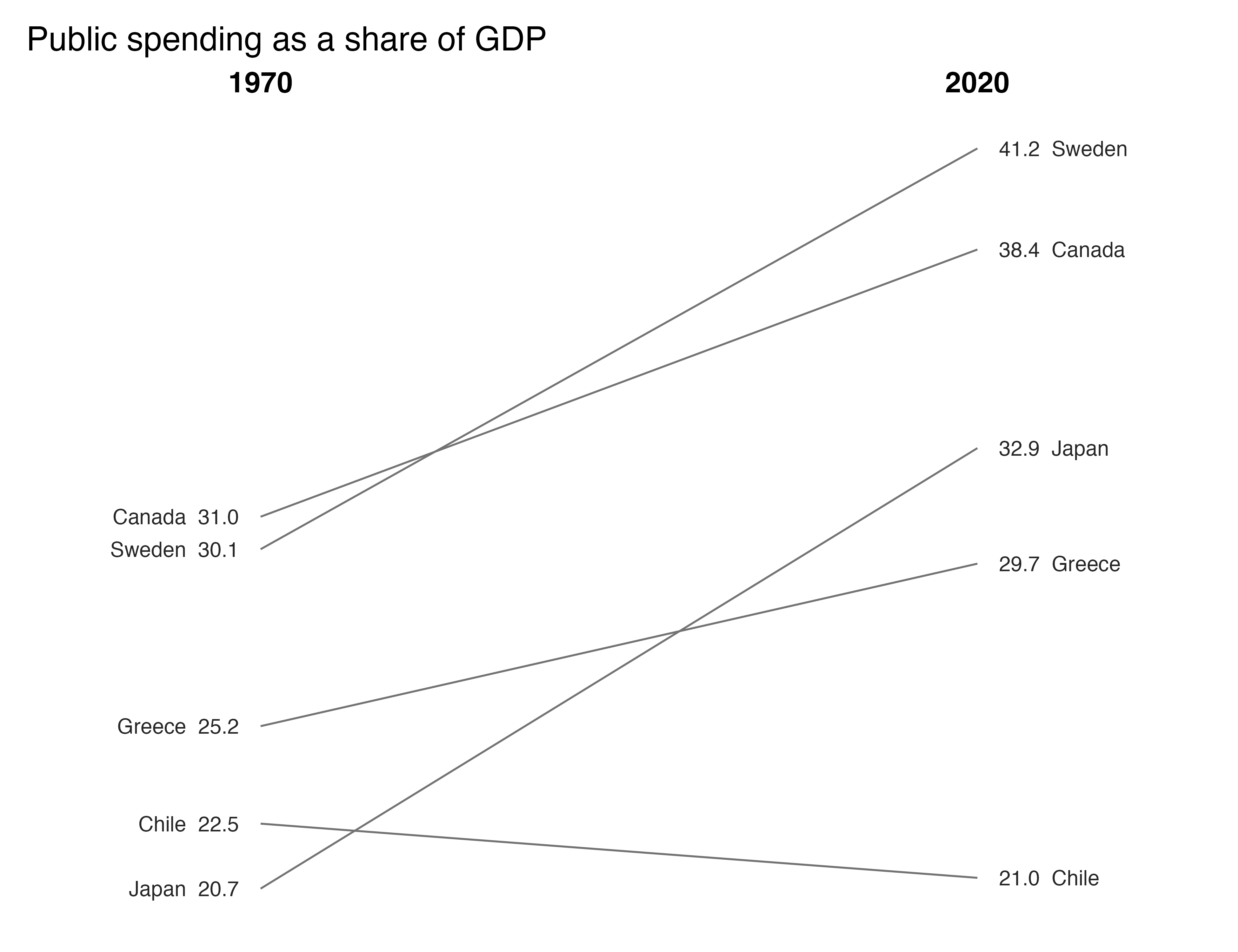
Sparklines
Sparklines show a series in a small space. Here the grey band marks the interquartile range, dots identify the extremes, and a label gives the final value.
d <- data.frame(
  month = rep(1:60, 4),
  value = c(cumsum(rnorm(60)), cumsum(rnorm(60)), cumsum(rnorm(60)),
            cumsum(rnorm(60))),
  series = rep(c("Wheat", "Maize", "Rice", "Barley"), each = 60)
)

sparklines(d, month, value, series)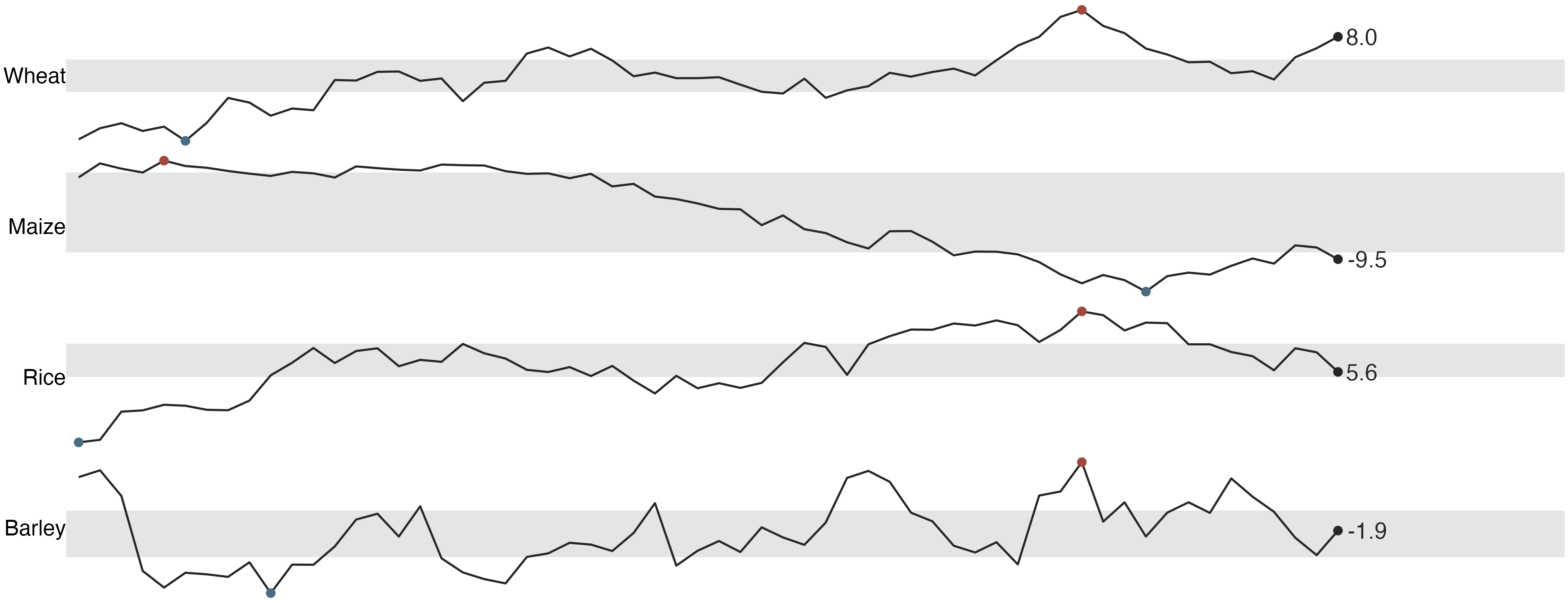
Small multiples
Use one panel per group when you want readers to make the same
comparison several times. facet_tufte() keeps the scales
fixed so levels can be compared across panels. It warns if you request
free scales.
ggplot(mtcars, aes(wt, mpg)) +
  geom_point(size = 1) +
  geom_rangeframe() +
  facet_tufte(~ cyl) +
  theme_tufte()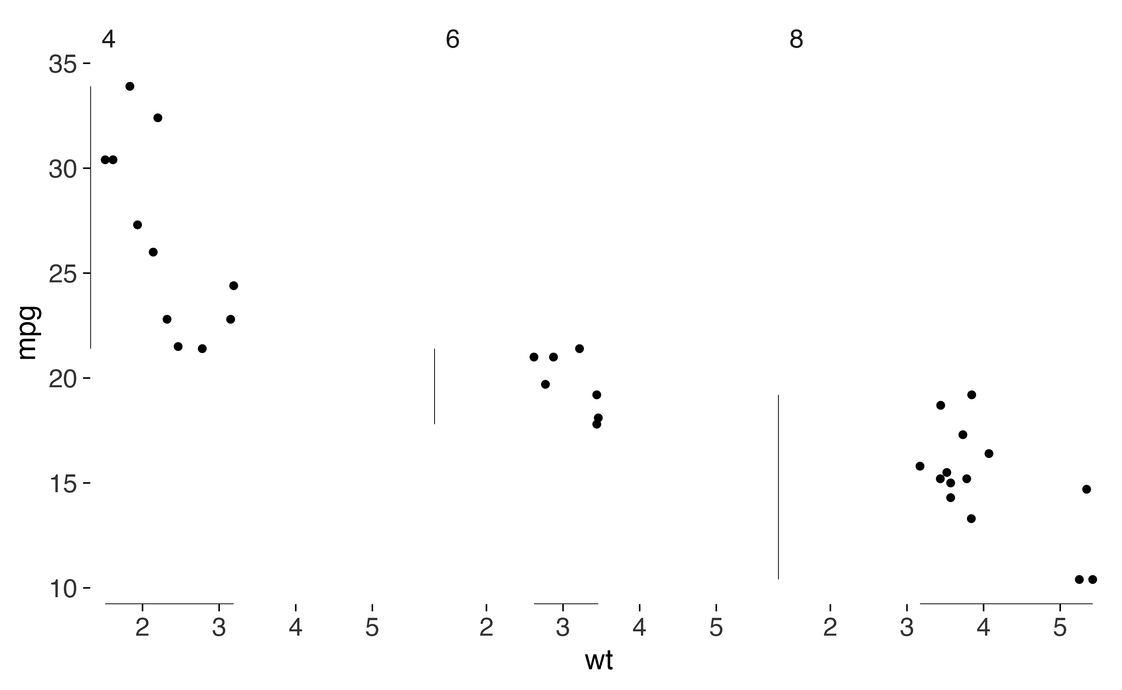
Before you save
Check the figure at the dimensions you’ll use. A long subtitle can
fit in a preview and still be cut off in the saved file.
check_labels_fit() estimates the space needed by titles,
axes, legends and facet strips. It doesn’t check text placed inside the
panel.
wordy <- lean +
  labs(subtitle = paste(rep("A subtitle that runs on rather too long", 4),
                        collapse = " "))

check_labels_fit(wordy, width = 6.5, height = 4)
#> Warning in check_labels_fit(wordy, width = 6.5, height = 4): 1 element will be clipped at 6.5in x 4in.
#> ✖ subtitle needs 10.18in but has 6.33in.
#> ℹ Hard-wrap the text, widen the canvas, or reduce the font size.
#> # A tibble: 7 × 4
#>   element                      required_in available_in fits
#>   <chr>                              <dbl>        <dbl> <lgl>
#> 1 layout (non-panel width)           0.611         6.5  TRUE
#> 2 layout (non-panel height)          0.815         4    TRUE
#> 3 subtitle                          10.2           6.33 FALSE
#> 4 x axis title                       0.167         5.89 TRUE
#> 5 y axis title                       0.333         3.18 TRUE
#> 6 x axis labels (side by side)       0.333         5.89 TRUE
#> 7 y axis labels (stacked)            0.667         3.18 TRUE
save_tufte() runs that check before saving. It defaults
to a width of 6.5 inches and uses cairo_pdf for PDF output.
Set strict = TRUE if a label that doesn’t fit, or a check
that can’t run, should stop the save.
save_tufte("figure-1.pdf", lean, width = 6.5, height = 4)What the package can’t do
tufte_principles() lists the principles and their
sources. The audited column identifies which ones the
package can check.
p <- tufte_principles()
p[!p$audited, c("principle", "implemented_by")]
#> # A tibble: 11 × 2
#>    principle                    implemented_by
#>    <chr>                        <chr>
#>  1 Above all else show the data theme_tufte()
#>  2 The dot-dash plot            geom_dotdash()
#>  3 Shrink the graphic           sparkline(), sparklines()
#>  4 Position beats length        geom_cleveland_dot()
#>  5 Layering and separation      tufte_pal(), scale_colour_tufte()
#>  6 Micro and macro readings     sparklines(), facet_tufte()
#>  7 Show comparisons             slopegraph(), facet_tufte()
#>  8 Show causality               NA
#>  9 Show multivariate data       facet_tufte(), sparklines()
#> 10 Sparklines                   sparkline(), sparklines(), sparkline_grob()
#> 11 Content counts most of all   NA
I use the audit while reviewing a figure, then read the figure alongside the argument. The checks can catch a truncated label or a distorted bar length. They can’t decide whether the research design supports a causal claim.