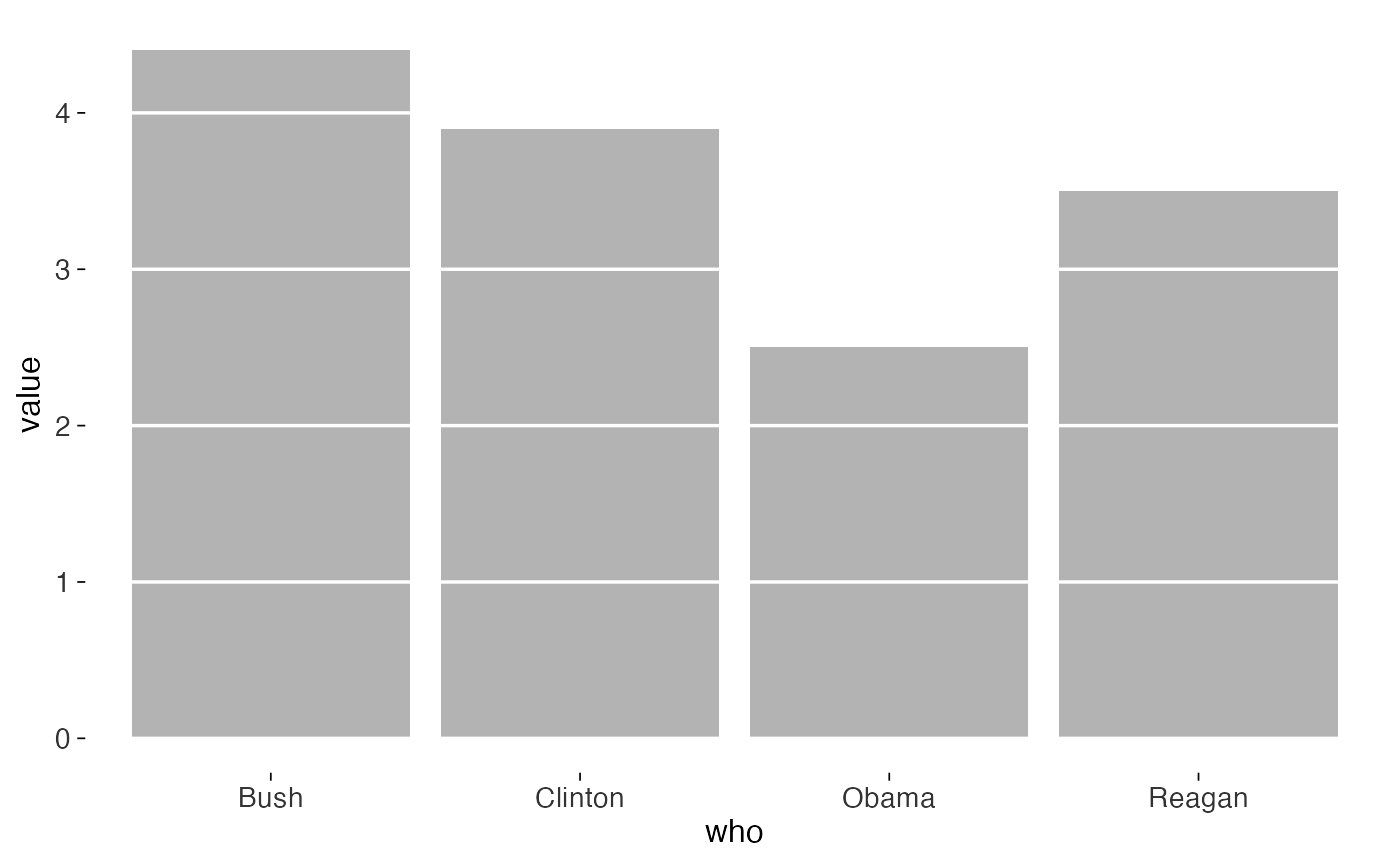
Gridlines can help readers estimate values from a bar chart. In Tufte's redesign, the lines appear as gaps through the bars. This layer draws those gaps using the background colour.
Usage
geom_col_tufte(
  mapping = NULL,
  data = NULL,
  stat = "identity",
  position = "stack",
  ...,
  sides = NULL,
  rule_colour = "white",
  rule_linewidth = 0.6,
  minor = FALSE,
  na.rm = FALSE,
  show.legend = NA,
  inherit.aes = TRUE
)

geom_bar_tufte(
  mapping = NULL,
  data = NULL,
  stat = "count",
  position = "stack",
  ...,
  sides = NULL,
  rule_colour = "white",
  rule_linewidth = 0.6,
  minor = FALSE,
  na.rm = FALSE,
  show.legend = NA,
  inherit.aes = TRUE
)
Arguments
- mapping, data, stat, position, na.rm, show.legend, inherit.aes, ...
Standard
ggplot2layer arguments. Seelayer().- sides
Which axis's breaks to erase through the bars. Defaults to
NULL, which works it out from the layer: vertical bars get the"y"breaks, and horizontal ones, however you wrote them, get"x". Pass"x"or"y"to override.- rule_colour
Colour of the erased rules. Defaults to
"white", which is correct on a white page; set it to your background colour otherwise.- rule_linewidth
Width of the erased rules. Defaults to
0.6.- minor
Logical. Erase minor breaks as well as major ones? Defaults to
FALSE.
Details
Use it with theme_tufte() and grid = "none". The layer
already draws the rules, so there's no need for the theme to add another grid.
Examples
library(ggplot2)
d <- data.frame(
  who = c("Reagan", "Bush", "Clinton", "Bush", "Obama"),
  value = c(3.5, 2.3, 3.9, 2.1, 2.5)
)
ggplot(d, aes(who, value)) +
  geom_col_tufte(fill = "grey70") +
  theme_tufte()