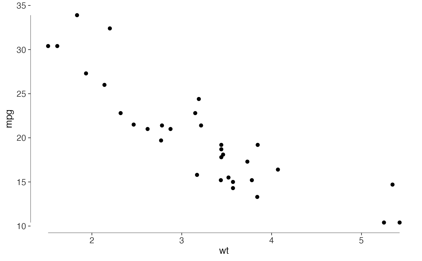
Remove the panel background, grid, panel border and legend frame. The theme follows Tufte's advice to reduce ink that doesn't represent data.
Usage
theme_tufte(
  base_size = 12,
  base_family = "",
  ticks = TRUE,
  axis_lines = FALSE,
  grid = c("none", "x", "y", "both")
)
Arguments
- base_size
Base font size in points. Defaults to 12.
- base_family
Base font family. Defaults to
""(the device default)."serif"is closer to Tufte's own books.- ticks
Logical. Draw axis tick marks? Defaults to
TRUE; ticks are data-ink in the weak sense that they locate values.- axis_lines
Logical. Draw conventional axis lines? Defaults to
FALSE. Add a range frame if you'd like axes tied to the data.- grid
One of
"none"(the default),"x","y"or"both". Draws a hairline grid where you ask for one.
Details
There are no axis lines by default. Add geom_rangeframe() or
geom_quartileframe(), or set axis_lines = TRUE for
ordinary axes.
I'd keep a grid when it helps readers estimate values. Use grid = "y"
or "x" for a light grid on one axis. For Tufte's bar design, with
rules erased through the bars, use geom_col_tufte().
Examples
library(ggplot2)
ggplot(mtcars, aes(wt, mpg)) +
  geom_point() +
  geom_rangeframe() +
  theme_tufte()