
What can a number tell us about a figure? Tufte proposes several measures in The Visual Display of Quantitative Information. I built these functions to make those measures easier to examine.
Here I explain how they’re estimated and what their limits mean in practice. All the data below are simulated.
set.seed(20260729)
n <- 400
d <- data.frame(
  x = rnorm(n, 50, 12),
  g = sample(c("Treated", "Control"), n, replace = TRUE)
)
d$y <- 12 + 0.42 * d$x + ifelse(d$g == "Treated", 3.1, 0) + rnorm(n, 0, 5)
The data-ink ratio
Tufte defines data-ink ratio as the share of ink devoted to the
non-redundant display of data. data_ink_ratio() estimates
it by rendering a plot twice, with and without its data layers.
Each pixel is weighted by its distance from the background colour. The difference between the two renderings estimates the data ink. This is an approximation, including at anti-aliased edges.
base <- ggplot(d, aes(x, y)) +
  geom_point(size = 1, alpha = 0.5) +
  labs(x = "Pre-treatment score", y = "Outcome")

r_base <- data_ink_ratio(base)
r_base
#>
#> ── Data-ink ratio
#> 19% of the ink in this figure varies with the data.
#> • data ink: 8567 pixel-equivalents
#> • non-data ink: 36866
#> • measured at 6.5in x 4in, 150 dpi
Much of the estimated ink here comes from the panel background and grid. Those elements are counted as non-data ink.
lean <- base + geom_rangeframe() + theme_tufte()
r_lean <- data_ink_ratio(lean)
r_lean
#>
#> ── Data-ink ratio
#> 81% of the ink in this figure varies with the data.
#> • data ink: 10762 pixel-equivalents
#> • non-data ink: 2560
#> • measured at 6.5in x 4in, 150 dpi
The data are the same. The estimated share of data ink is 4.3 times the original share.
Where it misleads
Overlapping marks count once. A dense group of points can therefore produce less measured data ink than the same points spread apart.
dense <- data.frame(x = rnorm(20000), y = rnorm(20000))
sparse <- dense[1:60, ]

lean_theme <- list(geom_rangeframe(), theme_tufte())

c(
  dense = data_ink_ratio(
    ggplot(dense, aes(x, y)) + geom_point(size = 0.4, alpha = 0.2) + lean_theme
  )$ratio,
  sparse = data_ink_ratio(
    ggplot(sparse, aes(x, y)) + geom_point(size = 0.4) + lean_theme
  )$ratio
)
#>     dense    sparse
#> 0.9899012 0.7331751
Redundant marks still count as data ink. The function can’t determine whether they repeat information, so large filled shapes can produce high ratios even when a smaller mark would show the same value.
The estimate also depends on the rendering size. Compare drafts at the same width, height and resolution.
vapply(
  c(3, 6.5, 12),
  function(w) data_ink_ratio(lean, width = w, height = w * 0.6)$ratio,
  numeric(1)
)
#> [1] 0.7533856 0.8074221 0.8237521
I use the ratio to compare drafts at the same dimensions. It doesn’t give me a target to optimize.
And a larger caveat: the principle itself is contested
The measurement’s limits are one issue. Whether a higher ratio helps readers is a separate empirical question.
Gillan and Richman (Human Factors, 1994) found that higher data-ink did make readers faster and more accurate, but concluded that the principle as stated is too simple: non-data ink isn’t one thing. An axis helps; a decorative background doesn’t; and which is which depends on the task and the graph type. Inbar, Tractinsky and Meyer (2007) found that readers preferred graphs that were not minimalist, accepting moderate reduction and rejecting Tufte’s version of it. Bateman and colleagues, in “Useful Junk?” (CHI 2010), found that embellished charts were recalled better over the long run than plain ones. More recently the accessibility argument has been pressed hard: a hairline on a white background at low contrast is lean and also unreadable for a good number of people.
I treat the estimate as a diagnostic. Knowing how much ink comes from
data layers can be useful, but it doesn’t establish that removing more
ink will help. A grid, for example, can make values easier to estimate.
That’s why theme_tufte() lets you keep one.
The lie factor
The lie factor compares the proportional change shown in the graphic with the proportional change in the data. A value of one means they agree. Tufte’s reference band is roughly 0.95 to 1.05.
The numeric method can be used with examples such as the fuel-economy graphic in The Visual Display.
lie_factor(c(18.0, 27.5), c(0.6, 5.3))
#> [1] 14.84211
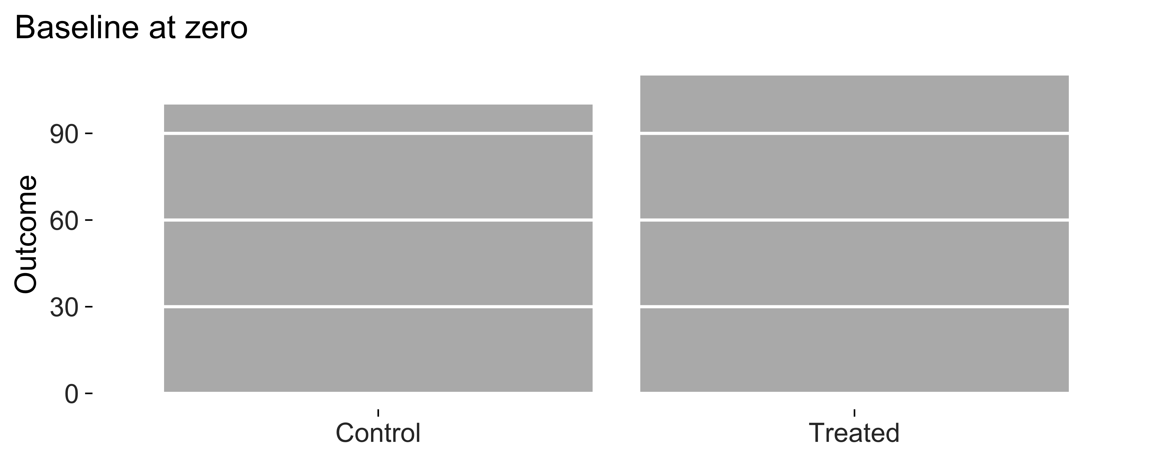
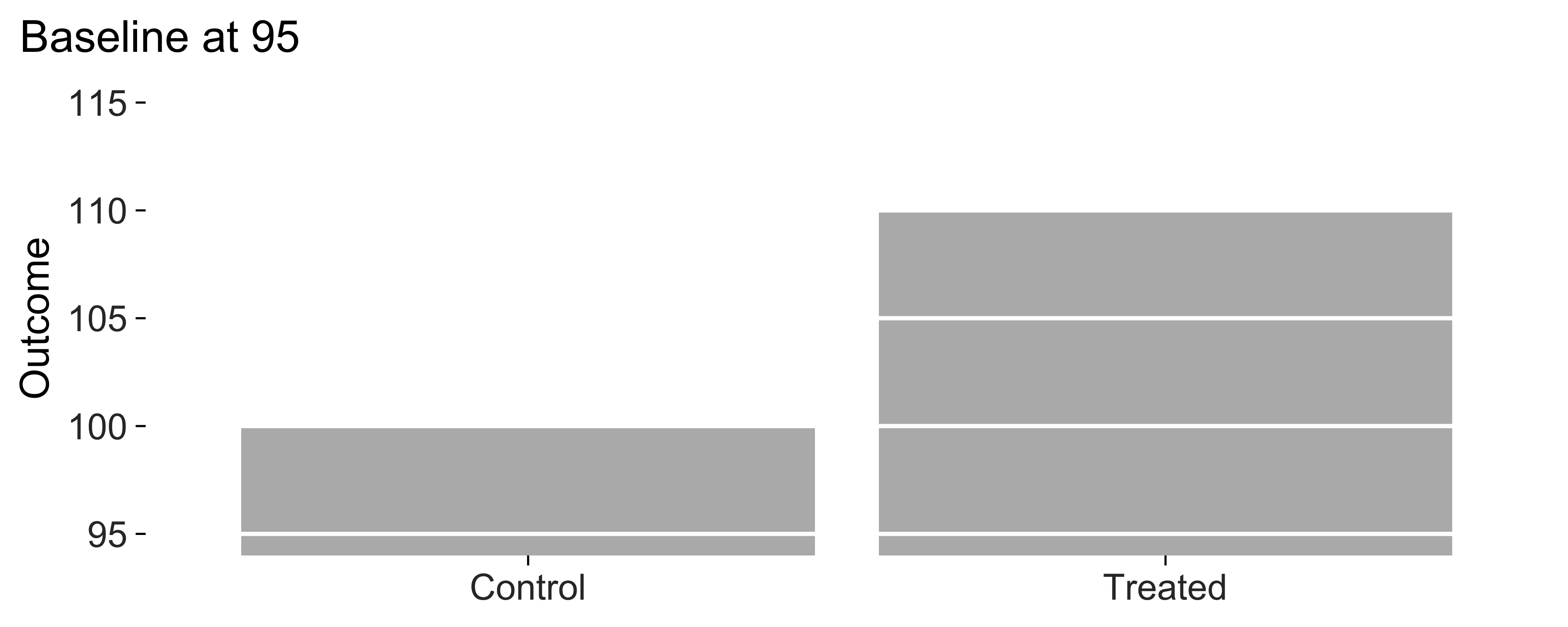
For a supported bar chart, the plot method measures the distortion caused by a non-zero baseline. Bar lengths then show different proportions from the underlying values.
means <- data.frame(
  condition = c("Control", "Treated"),
  outcome = c(100, 110)
)

honest <- ggplot(means, aes(condition, outcome)) +
  geom_col_tufte(fill = "grey72") +
  labs(x = NULL, y = "Outcome") +
  theme_tufte()

truncated <- honest + coord_cartesian(ylim = c(95, 115))

c(honest = lie_factor(honest), truncated = lie_factor(truncated))
#>    honest truncated
#>   1.00000  16.66667
The cropped version makes the relative difference look much larger. Here are the two versions side by side.
Where it misleads
The plot method checks bars. A line or dot plot can reasonably use an
axis that excludes zero because its marks show position.
lie_factor() returns 1 for a plot without
bars, but that doesn’t establish that the figure is accurate in other
respects.
Data density
Data density estimates entries per square inch of graphic. I use it to compare how much space different drafts give to the same information.
data_density(lean, width = 6.5, height = 4)
#>
#> ── Data density
#> 39.7 numbers per square inch of data graphic.
#> • 400 rows x 2 mapped variables = 800 entries
#> • over 20.14 square inches
The function multiplies pooled rows by the number of distinct mapped
variables. Constants outside aes() don’t count. Panel area
is estimated from the rendered plot; if that estimate isn’t available,
the whole canvas is used.
four_numbers <- data.frame(g = letters[1:4], v = c(3, 7, 5, 9))
data_density(
  ggplot(four_numbers, aes(g, v)) + geom_col_tufte() + theme_tufte(),
  width = 6.5, height = 4
)
#>
#> ── Data density
#> 0.4 numbers per square inch of data graphic.
#> • 4 rows x 2 mapped variables = 8 entries
#> • over 20 square inches
Read density alongside the number of entries. A compact plot can have a high density while showing only a few numbers. Layers that combine data sources or statistical summaries also need manual interpretation.
Checking that nothing is clipped
A label that fits in a preview can be cut off at the size you export.
check_labels_fit() estimates the space needed by titles,
axes, legends and facet strips at the requested dimensions. It doesn’t
measure text drawn inside the panel.
wordy <- lean + labs(
  subtitle = paste(rep("A subtitle that runs on rather too long", 4),
                   collapse = " ")
)

check_labels_fit(wordy, width = 6.5, height = 4)
#> Warning in check_labels_fit(wordy, width = 6.5, height = 4): 1 element will be clipped at 6.5in x 4in.
#> ✖ subtitle needs 10.18in but has 6.33in.
#> ℹ Hard-wrap the text, widen the canvas, or reduce the font size.
#> # A tibble: 7 × 4
#>   element                      required_in available_in fits
#>   <chr>                              <dbl>        <dbl> <lgl>
#> 1 layout (non-panel width)           0.609         6.5  TRUE
#> 2 layout (non-panel height)          0.809         4    TRUE
#> 3 subtitle                          10.2           6.33 FALSE
#> 4 x axis title                       1.49          5.89 TRUE
#> 5 y axis title                       0.681         3.19 TRUE
#> 6 x axis labels (side by side)       0.667         5.89 TRUE
#> 7 y axis labels (stacked)            0.556         3.19 TRUE
The check also looks for crowded axis labels. I’d still inspect the exported file, since the function can’t detect every overlap.
long_labels <- data.frame(
  condition = c("Non-post-conflict baseline", "Post-conflict, high intensity",
                "Post-conflict, low intensity"),
  value = c(3.1, 4.8, 4.0)
)

check_labels_fit(
  ggplot(long_labels, aes(condition, value)) + geom_col_tufte() + theme_tufte(),
  width = 4, height = 3
)
#> Warning in check_labels_fit(ggplot(long_labels, aes(condition, value)) + : 1 element will be clipped at 4in x 3in.
#> ✖ x axis labels (side by side) needs 5.08in but has 3.47in.
#> ℹ Hard-wrap the text, widen the canvas, or reduce the font size.
#> # A tibble: 6 × 4
#>   element                      required_in available_in fits
#>   <chr>                              <dbl>        <dbl> <lgl>
#> 1 layout (non-panel width)           0.526         4    TRUE
#> 2 layout (non-panel height)          0.581         3    TRUE
#> 3 x axis title                       0.694         3.47 TRUE
#> 4 y axis title                       0.417         2.42 TRUE
#> 5 x axis labels (side by side)       5.08          3.47 FALSE
#> 6 y axis labels (stacked)            0.667         2.42 TRUE
save_tufte() runs the check before writing the file. Use
strict = TRUE if a failed or unavailable check should stop
the save.
Putting it together
tufte_audit() runs these checks and reports the
measurements together.
bad <- ggplot(d, aes(g, y, fill = g)) +
  geom_col(stat = "summary", fun = "mean")

suppressWarnings(tufte_audit(bad, width = 6.5, height = 4))
#>
#> ── Tufte audit ──
#>
#> At 6.5in x 4in: 6 stated criteria not met.
#>
#> ── Not met
#> ✖ The panel uses a #EBEBEBFF background fill. Try removing it and compare
#>   whether the figure is easier to read.
#> Erase non-data ink - VDQI ch. 4
#> ✖ Minor gridlines are drawn. Consider whether readers need this level of detail
#>   to estimate values.
#> Erase non-data ink - VDQI ch. 4
#> ✖ A legend identifies the series. Consider direct labels with geom_text_last(),
#>   or separate panels with facet_tufte(), if either makes identification easier.
#> Integrate word, number and image - Beautiful Evidence ch. 5
#> ✖ 'g' is mapped to both position and colour. Consider whether both encodings
#>   help with the comparison.
#> Erase redundant data-ink - VDQI ch. 4
#> ✖ No caption is present. Add the data source with label_source() so readers can
#>   check where the numbers came from.
#> Documentation - Beautiful Evidence ch. 6
#> ✖ data mark #00BFC4 has contrast 1.9 against the background, below the
#>   published minimum of 3.0. Try a colour with greater contrast and inspect the
#>   result.
#> Legibility - WCAG 2.1, not Tufte
#>
#> ── Measured, not graded
#> Tufte states a direction for these rather than a threshold. Read them against
#> another draft of the same figure.
#> • Data-ink ratio 0.80: an estimated 80% of the ink comes from data layers.
#>   Compare drafts at the same dimensions; there's no target value.
#> • Data density 0.2 entries per square inch: 4 estimated entries over 17.1
#>   square inches. Read this alongside the figure and entry count.
#> • 2 distinct colours in use. This is a count, not a verdict on whether the
#>   colours help readers.
#> • 2 series share one panel. Try facet_tufte() if separate panels would make the
#>   comparison easier.
#>
#> ── Met
#> • No full panel border
#> • No pie chart
#> • Bars measured from zero
#> • Lie factor within Tufte's band
#> • Wider than it is tall
#> • Measured labels fit at the printed size
The output identifies unmet criteria and reports measurements separately. Here’s another version of the same data with the suggested changes.
good <- ggplot(d, aes(g, y)) +
  geom_tufteboxplot() +
  geom_rangeframe(sides = "l") +
  labs(x = NULL, y = "Outcome") +
  theme_tufte() +
  label_source("Simulated data, n = 400")

tufte_audit(good, width = 6.5, height = 4)
#>
#> ── Tufte audit ──
#>
#> At 6.5in x 4in: 0 stated criteria not met.
#>
#> ── Measured, not graded
#> Tufte states a direction for these rather than a threshold. Read them against
#> another draft of the same figure.
#> • Data-ink ratio 0.38: an estimated 38% of the ink comes from data layers.
#>   Compare drafts at the same dimensions; there's no target value.
#> • Data density 39.8 entries per square inch: 800 estimated entries over 20.1
#>   square inches. Read this alongside the figure and entry count.
#> • 1 distinct colour in use. This is a count, not a verdict on whether the
#>   colours help readers.
#> • One series in one panel. There's no series grouping to separate into small
#>   multiples.
#>
#> ── Met
#> • Panel carries no background fill
#> • No minor gridlines
#> • No full panel border
#> • No pie chart
#> • Lie factor within Tufte's band
#> • No legend to decode
#> • No variable encoded twice
#> • The figure names its source
#> • Wider than it is tall
#> • Ink clears the WCAG contrast minimum
#> • Measured labels fit at the printed size
Every figure in the paper at once
I use audit_figures() to review a set of figures
together. It lists the figures with the most unmet criteria first, along
with any checks that couldn’t run.
figures <- list(
  scatter = good,
  bars = bad,
  faint = ggplot(d, aes(x, y)) +
    geom_point(colour = "grey85") + theme_tufte() + label_source("Simulated")
)

suppressWarnings(audit_figures(figures, measure = FALSE))
#>
#> ── Tufte audit: 3 figures ──
#>
#> ── Stated criteria not met, most first
#> bars (6 not met)
#> Panel carries no background fill, No minor gridlines, No legend to decode, No
#> variable encoded twice, The figure names its source, Ink clears the WCAG
#> contrast minimum
#> faint (1 not met)
#> Ink clears the WCAG contrast minimum
#>
#> ── No failures among completed checks
#> • scatter
#>
#> ℹ Full detail for any one figure: `attr(x, "audits")[["<name>"]]`
You can also pass a directory containing plots saved with
saveRDS().
Why there’s no score
A pass applies to the check described. It doesn’t certify the whole
figure. Label fitting leaves panel text for manual review. Contrast
checks don’t resolve every overlap or filled label background.
Unsupported lie-factor comparisons can return an unavailable result. The
batch table’s skipped column identifies checks that
couldn’t run.
I’ve kept measurements without a stated threshold separate from
graded criteria. The criterion column in
tufte_principles() records that choice.
p <- tufte_principles()
p[p$criterion, c("principle", "source")]
#> # A tibble: 10 × 2
#>    principle                        source
#>    <chr>                            <chr>
#>  1 Erase non-data ink               VDQI ch. 4
#>  2 Erase redundant data-ink         VDQI ch. 4
#>  3 Revise and edit                  VDQI ch. 4
#>  4 The range-frame                  VDQI ch. 6
#>  5 The lie factor                   VDQI ch. 2
#>  6 Graphical integrity              VDQI ch. 2
#>  7 Proportion and scale             VDQI ch. 9
#>  8 Legibility                       WCAG 2.1, not Tufte
#>  9 Integrate word, number and image Beautiful Evidence ch. 5
#> 10 Documentation                    Beautiful Evidence ch. 6
Combining everything into a percentage would require a judgement about how much each criterion matters. I haven’t made that judgement for you. The audit gives counts and measurements you can examine individually.
These checks reflect my reading of Tufte’s principles. You can
inspect the source of each check and disagree with how I’ve implemented
it. tufte_principles() also records which principles the
package can’t check.
p <- tufte_principles()
p[!p$audited, c("principle", "source", "implemented_by")]
#> # A tibble: 11 × 3
#>    principle                    source                        implemented_by
#>    <chr>                        <chr>                         <chr>
#>  1 Above all else show the data VDQI ch. 4                    theme_tufte()
#>  2 The dot-dash plot            VDQI ch. 6                    geom_dotdash()
#>  3 Shrink the graphic           VDQI ch. 8                    sparkline(), spar…
#>  4 Position beats length        VDQI ch. 5                    geom_cleveland_do…
#>  5 Layering and separation      Envisioning Information ch. 3 tufte_pal(), scal…
#>  6 Micro and macro readings     Envisioning Information ch. 2 sparklines(), fac…
#>  7 Show comparisons             Beautiful Evidence ch. 6      slopegraph(), fac…
#>  8 Show causality               Beautiful Evidence ch. 6      NA
#>  9 Show multivariate data       Beautiful Evidence ch. 6      facet_tufte(), sp…
#> 10 Sparklines                   Beautiful Evidence ch. 2      sparkline(), spar…
#> 11 Content counts most of all   Beautiful Evidence ch. 6      NA
I still need to ask whether the figure answers the research question and whether the design supports my interpretation. The measurements help me inspect the drawing; they don’t answer those questions.