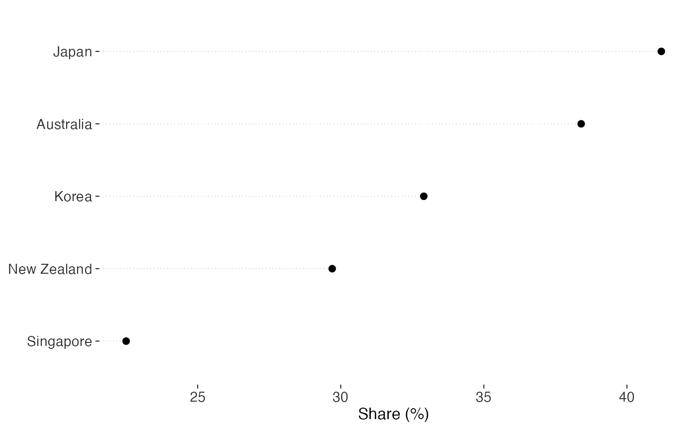
A dot plot is useful when you want to compare values in a narrow range. Dots show position on a scale, so the axis can exclude zero without changing what the length of a mark represents.
Arguments
- mapping, data, stat, position, na.rm, show.legend, inherit.aes, ...
Standard
ggplot2layer arguments. Seelayer().- orientation
Which axis holds the categories.
"y", the default, puts categories down the left and values across. This leaves room for category names."x"transposes the layout.- leader
One of
"axis"(the default), which draws the leader from the axis to the dot,"full", which runs it the whole width of the panel, or"none".- leader_colour, leader_linetype, leader_linewidth
Appearance of the leader line. Keep it light enough to distinguish from the dots.
Details
Cleveland's leader lines help readers follow each row to its value. You can extend them across the panel or turn them off.
If rank is the comparison you want, sort the categories by value before
plotting. Use stats::reorder() or forcats::fct_reorder().
Examples
library(ggplot2)
d <- data.frame(
  country = c("Japan", "Korea", "Australia", "New Zealand", "Singapore"),
  value = c(41.2, 32.9, 38.4, 29.7, 22.5)
)

ggplot(d, aes(value, stats::reorder(country, value))) +
  geom_cleveland_dot() +
  labs(x = "Share (%)", y = NULL) +
  theme_tufte()